The new Facebook Timeline has completely revamped the business page layout. From the new cover image to the removal of welcome tabs, Facebook is constantly changing, making it very important for businesses to stay up to date to maximize social engagement.
In this post we will cover optimization for the cover image. In future posts we will come everything from Facebook apps to utilizing sticky posts to drive awareness.
Who should read this post: business owners that are looking to improve the quality of their brand on Facebook
What you will learn: absolutely everything about optimizing the cover image for the Facebook Timeline
First and foremost, take the time to read the Timeline Guidelines.
If you’re too lazy to read, don’t worry, we got you covered. The most relevant section for you to read at this moment is this one:
Covers may not include:
- Price or purchase information, such as “40% off” or “Download it on socialmusic.com”;
- Contact information such as a website address, email, mailing address, or information that should go in your Page’s “About” section;
- References to Facebook features or actions, such as “Like” or “Share” or an arrow pointing from the cover photo to any of these features; or
- Calls to action, such as “Get it now” or “Tell your friends.”
This is important because it greatly limits how you use your cover image. You cannot use it for promotional purposes, nor can you use it to drive action. This means that the core functionality of the cover image is to immerse the Facebook user into your brand.
We’ll get to the immersion part in a bit. Next, lets talk about dimensions.
Facebook cover specs and dimensions
Facebook timeline cover specs:
- 851px wide
- 315px tall
Very, very strange dimensions, right?
Because of this strange dimension, it makes it very difficult to use a regular digital camera photo. Lets take a look at some examples of photos that just don’t come out right.
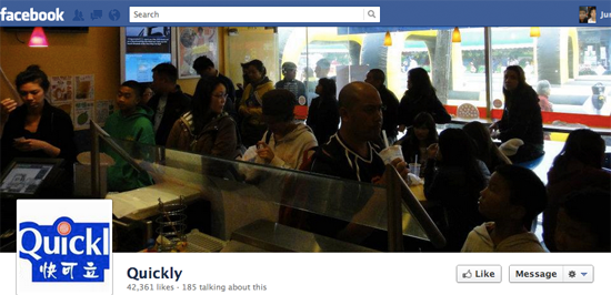
Take a look at the Quickly cover image below.
You can tell what they were trying to do:
- Show happy customers at the restaurant
- Capture a long line so that it demonstrates that Quickly is popular
- Demonstrate customers drinking to entice Facebook users to want a boba drink
The idea was good, but the execution is poor. Not only is the image inside the store too dim, but it’s highly crowded, making it difficult for the user to focus on just one element. Furthermore, you can see how using a digital camera photo looks awkward – the image comes out very skinny, making it difficult to see what’s actually going on in the photo.
Get creative and use the resources available to you
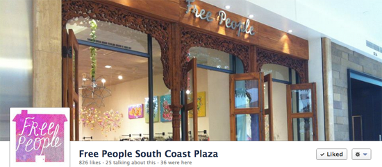
Free People South Coast Plaza is an example of the right idea but with average execution.
Though the image is taken from a digital camera, the photographer was able to capture a well-lit entrance, welcoming the user to the Facebook Page. The image of an entrance is decent at best. Your Facebook Fans already know what your entrance looks like because they’ve been to your store. Instead of the entrance, a far better image to display is an image capturing your in-store brand.
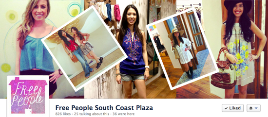
I quickly made my own cover image for Free People South Coast Plaza utilizing the images that the employees have already uploaded to the Facebook Page.
I quickly made this in about 5 minutes using Photoshop. I know I’m not the best designer in the world, but you can see from my revision how the store can welcome customers with an image of their in-store brand: friendly, fashionable employees that are here to help you with your shopping needs. What better way to connect with your fans on Facebook than to empower your employees and to make them feel recognized on your Facebook Page.
Free People might even consider taking pictures of customers inside of the store and requesting permission to post their image on Facebook. They can then select the best images and recognize their customers on a collage on their Facebook Timeline Cover.
Make your fans crave your product
If you’re a restaurant, then the cover image is a great place to make your customers crave your food.
What NOT to do:
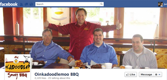
Oink a Doodle Moo presents us with another awkward digital camera photo.
I understand that they want to welcome you to their page with open arms, but a restaurant needs to show fans the food. The food is the reason that customers love your restaurant in the first place, so show them an enticing photo.
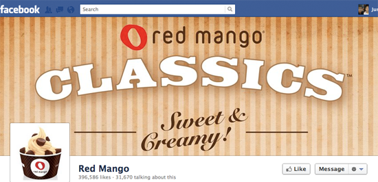
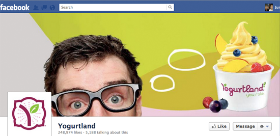
Which of the two images below makes you crave their yogurt:
or
Yogurtland effectively uses an image of a person thinking about their yogurt. The Yogurtland image provokes a much more emotional response than the image that Red Mango uses.
My two favorite cover images for restaurants
These images are perfect:
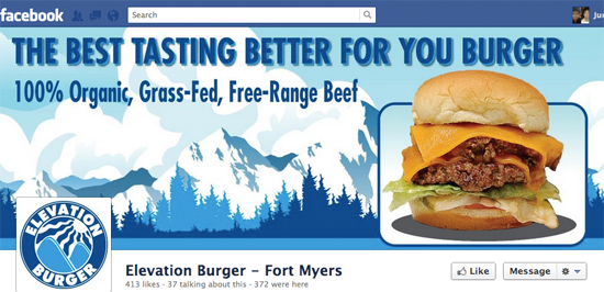
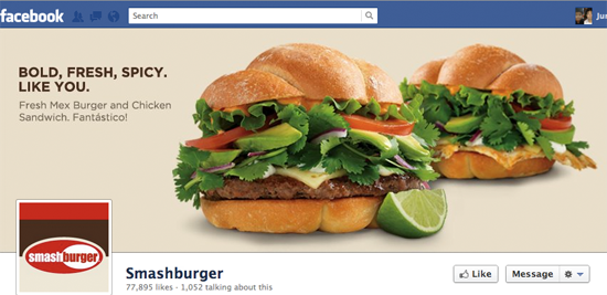
- Just look at the succulent burgers – it makes me want to go to an Elevation Burger or Smash Burger right now to eat the food
- Elevation Burger directly tells you what they’re about: 100% organic beef
- Smash Burger uses their cover image to promote their new burger
If you’re a restaurant owner, then these are the images that you need to model.
–
Utilize the above techniques to create your perfect Facebook Timeline Cover. Once you’ve created it, attach a link to your Facebook page in the comments section so that we can take a look and provide our feedback.


