Feedback for my new Gamification Blog Design
This is a special post mostly for my awesome regular readers. I was thinking about just suddenly one-day update my blog with a new look and surprise a lot of people, but at the end, I decided to go with the lean-startup way of getting user feedback and adjusting towards a final good product.
I’ve been thinking about updating the design of my blog for a while now. This theme has been around for 5 years and it’s not completely SEOed up. I also wanted something that stands out more and is more memorable, more immersive and game-like. I wanted something that people can explore too.
So I ran some analysis of my own blog. I’ll write about this later, but for every gamified campaign, the first thing I tell my clients to do is to define the following (I call this the Strategy Dashboard):
- Business Metrics -> Game Objectives
- Users -> Players
- Desired Actions -> Win-State
- User Metrics -> Stats
- Incentives -> Carrots
For my own blog analysis, I won’t boggle you down with the details, but for two of the items above, I determined
Business Metrics for my Gamification Blog (based on order of importance)
- Consulting and Speaker Engagements
- Contact Form Submissions
- Go to Octalysis Post
- Watch Videos
- Comments
- Share on Social Networks
- Unique Serious Visitors
- Passive Revenue
Desired Actions for my Gamification Blog (Based on Chronological Order)
- Go onto site through interesting content
- Comment on the blog
- Get to Octalysis Post
- Get to Video Guides
- Get to About Me Page and Consulting Page
- Signup to the Captain Up widget on the right
- Click on Contact Form
- Complete Contact Form
Thinking behind new Gamified Blog
My new blog had a few goals. The first goal is to get people to go onto my Octalysis post. From my Google Analytics, I see that anyone who goes onto my Octalysis post has by far lower bounce rates, higher time-on-site, and higher return chances. This basically means that if I wanted engaged users, I need to pipe them into my Octalysis as much as possible. As you can see, I’m also incorporating more of that into my current design.
The second goal is to get people to start watching my Beginner’s Guide to Gamification Video Series. At the beginning, this started off as a hobby project (and I had no idea how busy I would be these days so I gave myself an ambitious goal), and even though it was fun to show friends and colleagues, I’ve been a bit self-conscious about it, as it may be too non-serious/goofy to show potential enterprise clients.
If you have been following the series, you know that in the episodes where I’m getting beat up by alien lobster creators, I’m going down a snow slope while trying to teach gamification, and there’s even an episode where I sing a cover song that is entirely about how awesome I am (lyrics goes: “Yu-kai Chou – he’s my hero! Gonna take boringness down to zero!” And yes, great for laughs between friends, but I’d always thought this would deter me from getting new clients.
So for a while, I hid my videos on my site so average visitors won’t find them.
However, after a while, I noticed that even though less than 5% of my site visitors watched my video, more than 50% of the people who reached out to me for consulting have watched the videos, which shows that, if anything, they do not hurt my chances of getting consulting gigs (and may even help!). As a result, I want my new users to see my video.
The third goal is to make sure people recognize who the author of the site is. More often than not, people would browse through a bunch of content, learn from it, and not realize who the author is. Since part of my goal for my site is personal branding, I think it’s crucial that people recognize who I am. Perhaps, that’s also the reason why my videos convert well – I ascend from pure information into a personality.
Implementation Plan for the Gamification Blog
So the idea I had was to do a few things:
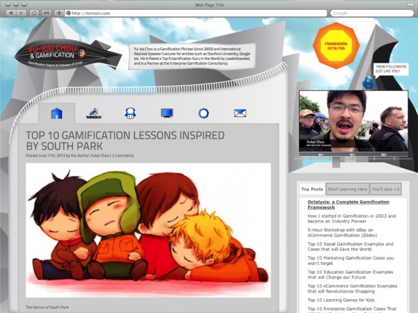
- Create an immersive experience through a futuristic city (sort of like being in a game)
- Every element should be something relevant to the city
- My main blog content should be an LED screen on a building (sort of like New York Times Square)
- My video should be a TV Screen or billboard in the city, and it either will show the latest video, or perhaps a live show I’m putting on at the moment.
- The Octalysis post should be the sun on top (and is the most abstract shape/concept in the chart) so people would want to click on it.
- The sidebar should also be a side building with a variety of content on it
- My picture and bio should be another object in the city, primarily a blimp that is pulling a big banner ad.
- I’m experimenting with icon-based navigation menus to add a bit of fun into the process. You won’t know exactly what it is at the beginning, but eventually you might get curious 😉
- Instead of having a box that talks about my Twitter followers, it would be cool if the twitter bird sits on top of the screen and talks to the reader. Sometimes I can even put in messages like, “Yu-kai’s new book is coming out!” or “Live show happening in 9:29)
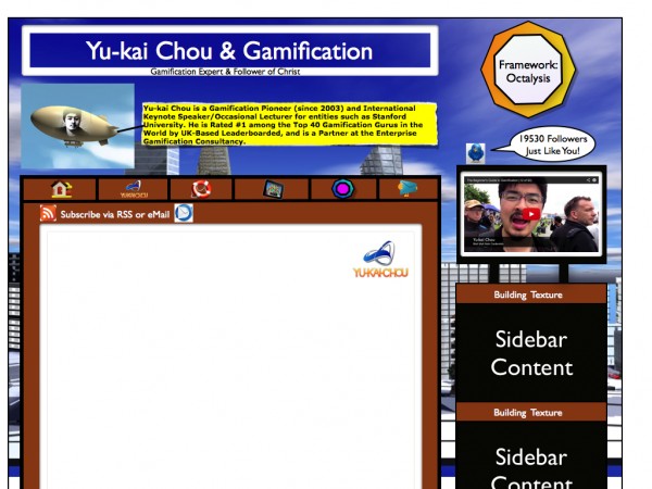
Original concept design work for the Gamified Blog
A lot of people ask me what I actually do for clients. Well, besides helping them define the 5 things mentioned above in the Strategy Dashboard, run an Octalysis audit through the Discovery, Onboarding, Scaffolding, and Endgame Phase, adding improvements/suggestions based on the 8 Core Drives, refining everything down to a feature list based on the effectiveness and difficulty scores, I also help clients create concept wireframes so their designers/engineers know exactly what to build.
Below is a “concept” wireframe I made for myself. I passed the below as the original concept to my designer, and after 7 reiterations, we finally reach to what you see above.
Personal Blindspots for the Gamification Blog
I’ll be honest, when it comes to designing my own stuff, especially when it’s something so personal with my face all over the place, it’s hard to be objective. I feel like I have a lot of blindspots because I want a very vibrant and rich world where users can explore and enjoy the experience of browsing through a variety of content (I have a lot of interesting/cool ideas coming up…)
However, I also often tell my clients that they need to be very clear on the “desired actions” towards the users’ “win-state.” If a user CAN do 20 things, they end up feeling decision paralysis and end up doing nothing. I had a feeling I was straying away from my own advice, so I made some tough decisions to cut out some really cool but complex ideas.
Still I feel that the new design might be too complex for someone newly on the site. At the same time, my own credentials are very small. I feel like a new user who has not seen this a thousand times would feel overwhelmed by all the stuff that they can interact with. This is usually fine in a virtual world, but I have not tested this in a content website.
Fresh-Eyes Feedback Please?
I would love to get some feedback from all of you before I commit resources to engineers to build this out. I also might take this post down once I have decided and the development work starts (so hopefully for some other readers this will still have some element of surprised 😉 ). Please let me know if you have any concrete advice and suggestions that I can take before having a developer build it.
Thanks!