

Put the same button in two places on a screen and you will get two different conversion rates. Move it closer to where the cursor already sits and make it bigger, and more people click it. Shrink it and shove it into a far corner, and fewer do. Nothing about the offer changed. Only the geometry did, and the geometry alone moved behavior.
That effect has a name and, unusually for behavioral science, an actual equation behind it. Fitts’s Law says the time it takes to move a pointer to a target depends on two things: how far away the target is and how big it is. Far and small is slow. Near and large is fast. Paul Fitts worked this out in 1954, before there were screens to click on, and it has survived every input device humanity has invented since: mouse, trackpad, touchscreen, stylus, VR controller, eye tracker. The same curve fits all of them.
For anyone who designs behavior, this is one of the few laws you can take to the bank. It is quiet, it is physical, and it is almost always working against the action you most want a user to take, because the action you want is usually one click further away and one pixel smaller than it should be. Get the geometry right and you can make the good choice feel effortless. Get it cynical and you can bury the cancel button so deep that people give up trying to leave. Same law. Opposite ethics. Let’s get into how it works, where it breaks, and how it fits inside a real motivation framework instead of floating as a UX tip.
Speed Run Notes
- Fitts’s Law: the time to hit a target grows with the distance to it and shrinks as the target gets bigger. Far + small = slow; near + large = fast. Paul Fitts, 1954.
- The formula is MT = a + b · log₂(2D/W). The log term is the Index of Difficulty, measured in bits. Pointing is literally treated as an information-transmission task.
- It is not a Core Drive. It is a friction law: it governs the motor cost of an action, not whether anyone is motivated to take it. Octalysis supplies the motivation; Fitts supplies the cost.
- Screen edges and corners are the cheapest pixels you have. The pointer can’t overshoot past an edge, so edges and corners behave like infinitely large targets, which is why the menu bar and Start button live there.
- The ethical tell is friction asymmetry. A giant “Subscribe” and a tiny, far, buried “Cancel” is Fitts’s Law turned into a dark pattern.
- “Lazy users” usually aren’t lazy. A low-motivation action behind a high-friction target is one the body is right to skip. Fix the target before you blame the human.
Table of Contents
In This Article
- What Is Fitts’s Law?
- The Formula, in Plain English
- The 1954 Experiment That Started It
- What Fitts Got Right
- Where Fitts’s Law Falls Apart
- What’s Actually Happening in the Hand and Brain
- Fitts’s Law vs the Other UX Laws
- Fitts’s Law in the Real World
- Applying Fitts’s Law with the Octalysis Framework
- The Practical Playbook
- Frequently Asked Questions
Author Credibility: Yu-kai Chou

Yu-kai Chou created the Octalysis Framework after studying gamification since 2003 — years before the term entered mainstream vocabulary. As a Human-Systems Architect & Behavioral Designer, his framework has been applied by LEGO, Microsoft, Porsche, Coca-Cola, Salesforce, and MrBeast, impacting over 1.5 Billion Users.
Chou has taught the Octalysis methodology at Harvard, Stanford, Yale, Tesla, Google, BCG, and IDEO.
His work has been cited by Harvard, Stanford, MIT, Forbes, Wall Street Journal, Wired, US Department of Energy, NIST, NSF, NCBI, US Department of Education, ClinicalTrials.gov, and Google Scholar — with 3,700+ more academic publications. Explore his books here.

What Is Fitts’s Law?
Fitts’s Law is a model of how long it takes a person to point at something. Reach for a coffee mug, tap a phone icon, drag a cursor to a menu. All of these are aimed movements, and all of them obey the same pattern. The bigger the target and the shorter the distance, the faster you land on it. The smaller the target and the longer the distance, the slower and more error-prone you get.
That sounds obvious until you notice how precise it is. This is not a vague “bigger is better” guideline. It is a quantitative relationship that holds across an enormous range of conditions, and it lets you predict, in milliseconds, how much slower a particular layout will be before you ever build it. A designer who internalizes Fitts’s Law stops arguing about button placement from taste and starts reasoning about it from physics.
The headline claim is simple. Movement time depends on the ratio between distance and target size, not on either one alone. Doubling the distance does not double the time, and shrinking a target hurts you more when the target is already small. The relationship is logarithmic, which has a few surprising consequences we’ll get to. For now, hold onto the core picture: every clickable thing on your interface has a cost, that cost is set by how far the user’s pointer has to travel and how forgiving the target is, and you control both numbers.
Why should a behavioral designer care about something this mechanical? Because motivation is necessary but never sufficient. A user can want to do something and still not do it if the doing is annoying enough. Fitts’s Law is one of the cleanest ways to measure “annoying enough.” It turns the fuzzy idea of friction into a number, and numbers are what let you make trade-offs on purpose instead of by accident.
The Formula, in Plain English
Here is the equation people quote, and here is what it actually means once you strip the intimidation off it.
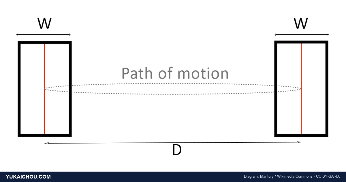
MT = a + b · log₂(2D / W)
MT is movement time, how long the aimed movement takes. D is the distance from the starting point to the center of the target. W is the width of the target along the direction of travel, which you can think of as how much room for error you have. The a and b are constants you measure for a given person and device: a is the fixed start/stop overhead, and b is how much each additional unit of difficulty costs in time.
The interesting part is the log term, log₂(2D / W). This is called the Index of Difficulty, or ID, and it is measured in bits. Yes, the same bits as in computer memory and information theory. Fitts borrowed the idea straight from Claude Shannon’s work on communication channels and treated the human arm as a channel transmitting information. A hard pointing task (a far, narrow target) carries more bits of difficulty than an easy one. The whole law is really the statement that your motor system has a roughly fixed information-processing rate, so harder targets take proportionally longer.
Why the relationship is logarithmic, and why that matters
The log is the part most people skip, and it’s the part that pays off. Because difficulty scales with the logarithm of the distance-to-width ratio, going from a tiny target to a slightly-less-tiny one buys you a lot, while going from a big target to a huge one buys you almost nothing. The returns on enlarging a target diminish fast.
This is why the practical advice “make important buttons bigger” has a ceiling. Doubling a small button’s size can meaningfully cut acquisition time. Doubling an already-large button barely moves the needle and just wastes screen real estate you could spend elsewhere. The log also explains why distance matters less than novices expect: moving a target twice as far does not make it twice as slow, because you’re inside a logarithm. Size and distance both matter, but their effect compresses as they grow.
The Shannon refinement
Fitts’s original formula has a small flaw: for very easy targets the Index of Difficulty can go to zero or even negative, which is nonsense for a time. In 1992, the HCI researcher Scott MacKenzie proposed the now-standard “Shannon formulation,” ID = log₂(D/W + 1), which never goes negative and fits real data better, especially at the easy end. If you ever see Fitts’s Law written with a “+1” inside the log, that’s why. It’s the same law, cleaned up to behave at the boundaries. The practical takeaway doesn’t change: distance up, time up; width up, time down; and it’s all logarithmic.
The 1954 Experiment That Started It
Paul Fitts was an experimental psychologist working on human performance, in an era shaped by aviation and the problem of designing cockpits people could actually operate under stress. His 1954 paper, “The information capacity of the human motor system in controlling the amplitude of movement,” published in the Journal of Experimental Psychology, asked a deceptively narrow question: how fast can a person move between two targets of a given size and separation, over and over?
The setup was almost comically low-tech. Participants tapped a stylus back and forth between two metal plates as fast as they could without missing. Fitts varied the width of the plates and the distance between them, then measured the tapping rate. Out of that simple reciprocal-tapping task came the equation that now governs the design of multi-trillion-dollar software industries. He followed it up in 1964 with James Peterson, showing the same law held for discrete single movements, not just rapid back-and-forth tapping. The pattern held across both kinds of task.
For two decades it stayed mostly inside motor-control research. Then the personal computer arrived and needed a pointing device. In 1978, Stuart Card, William English, and Betty Burr at Xerox PARC ran a now-famous study comparing the mouse against an isometric joystick, step keys, and text keys for selecting text on a screen. The mouse won on speed and error rate, and, the part that mattered for theory, the mouse’s pointing times fit Fitts’s Law almost perfectly, with a slope close to what other eye-hand tasks produced. That finding helped settle the mouse as the dominant pointing device and gave interface designers a predictive tool they’ve leaned on ever since.
So the chain is worth appreciating. A 1954 study about tapping metal plates, motivated by cockpit ergonomics, became the reason the close button is in the corner of your screen and the reason your phone’s primary action is a fat tappable bar near your thumb. That is an unusually long and load-bearing afterlife for one equation.
What Fitts Got Right
Plenty of psychological “laws” are really tendencies with big error bars. Fitts’s Law is closer to the real thing, and three properties explain why it earned its status.
First, it is genuinely predictive. Give the model the distance, the width, and a person’s measured constants, and it will tell you the movement time with accuracy that holds up in experiment after experiment. Most behavioral findings describe; this one forecasts. You can use it to compare two layouts on paper and know which is faster before a single user touches either.
Second, it is device-independent in a way nobody had any right to expect from a 1954 stylus study. The same mathematical form describes mouse pointing, finger taps on glass, head pointing in virtual reality, foot pedals, and trackballs. The constants change from device to device, but the shape of the law does not. When a single equation survives the jump from a metal plate to a VR headset, it’s telling you it captured something real about the human motor system rather than something incidental about the apparatus.
Third, it gave human-computer interaction a real unit of measure: throughput, expressed in bits per second, which lets you compare input devices on a level field. The international standard for evaluating pointing devices (ISO 9241, the throughput methodology) is built directly on Fitts’s Law. Before Fitts, “this input device feels faster” was an opinion. After Fitts, it became a measurement. That shift, from taste to throughput, is most of why the law still anchors interface research seventy years on.
Where Fitts’s Law Falls Apart
A law this clean invites overreach. Fitts’s Law is real, but it models one narrow thing, the motor cost of an aimed movement, and people routinely stretch it to carry weight it can’t. Here is where it breaks.
It only models the movement, not the decision
Fitts’s Law starts the clock once you know where you’re going. It says nothing about the time spent deciding which target to aim for. On a screen with forty options, the slow part isn’t the pointing; it’s the visual search and the choice. That cost belongs to other models: Hick’s Law for decision time among options, and the broader literature on cognitive load. Designers who optimize pointing while ignoring choice can build an interface where every button is a millisecond away and the user still freezes, because you gave them forty buttons. Pointing speed is worthless if the person can’t decide where to point.
The classic formula is one-dimensional
Fitts measured movement along a single line, so width means width along the direction of travel. Real targets are two-dimensional, and the direction you approach from changes the effective width. A long, thin menu item is easy to hit when you come at it broadside and hard when you come at it end-on. The standard one-dimensional law ignores this. Researchers have patched it with two-dimensional models that use the smaller of width and height, or a weighted combination, but the textbook equation quietly assumes a geometry that real interfaces violate constantly.
It assumes a pointer, and touch and gaze bend the rules
The law was built for a controlled stylus and generalizes beautifully to the mouse. Touch is messier. Fingers occlude the very target they’re aiming at, the “fat finger” contact area sets a hard floor on how small a target can usefully be (independent of the math), and on a phone the dominant cost is often whether a target sits inside the thumb’s comfortable arc rather than how far away it is in raw pixels. Eye-gaze and VR pointing add their own wrinkles: jitter, calibration drift, and fatigue that the law doesn’t account for. Fitts gives you the backbone, but on modern hardware you have to add the biomechanics it never modeled.
What’s Actually Happening in the Hand and Brain
The equation is a black box until you ask why aimed movement should follow a logarithm at all. The accepted answer is that a pointing motion isn’t one smooth glide. It’s two phases stitched together.
The first phase is ballistic: a fast, pre-planned launch that throws your hand roughly toward the target. This phase is open-loop, meaning your motor system fires it off without waiting for feedback, the way you’d toss a ball. It’s quick but imprecise, and on its own it usually overshoots or undershoots.
The second phase is corrective: a series of smaller, feedback-driven adjustments that home in on the target, each one using your eyes to check the gap and nudge the pointer closer. This closed-loop homing is where the precision comes from, and it’s where the time goes. The harder the target (farther, narrower), the more corrective sub-movements you need, and each correction costs time. This iterative-corrections idea, developed by researchers including Crossman and Goodeve, is the leading mechanical explanation for why the law is logarithmic: each correction closes a roughly constant fraction of the remaining distance, and closing a fraction repeatedly is exactly what produces a log.
The practical payoff of knowing this is that “make the target bigger” and “make the target closer” attack two different parts of the movement. A closer target shortens the ballistic launch. A wider target reduces the number of corrective sub-movements at the end, because you can be sloppier and still land inside it. The widest, most forgiving targets cut the expensive corrective phase to almost nothing, which is the deep reason large targets feel so effortless: you’re not paying for precision you don’t need.
Fitts’s Law vs the Other UX Laws
Fitts’s Law travels in a pack of interface laws, and people blur them together. Keeping them distinct is what lets you diagnose the right problem.
Fitts’s Law vs Hick’s Law
Hick’s Law is about decision time: how long it takes to choose among options, which grows with the number of options. Fitts’s Law is about movement time: how long it takes to reach the option you already chose. They describe consecutive stages of the same act. Hick governs “which one?”; Fitts governs “now go get it.” A cluttered menu can be slow for both reasons at once, and the fixes differ. Fewer options helps Hick. Bigger, closer options help Fitts. Confuse them and you’ll enlarge buttons on a screen whose real problem is that it offers too many choices: a choice-overload problem wearing a pointing-speed costume.
Fitts’s Law vs the Steering Law
Fitts’s Law covers pointing to a target. It says nothing about moving through a constrained path, like sliding along a cascading submenu without your cursor slipping out of the corridor. That trajectory problem is governed by the Steering Law, derived for HCI by Johnny Accot and Shumin Zhai in 1997, where time grows with the length of the tunnel divided by its width, and it grows linearly, not logarithmically. The infamous difficulty of keeping your cursor inside a multi-level dropdown is a steering problem, not a Fitts problem, which is why good menus add invisible “triangle” tolerance zones instead of just enlarging the items.
Fitts’s Law vs the thumb zone
On mobile, raw Fitts geometry gets overridden by anatomy. The “thumb zone” maps which parts of a phone screen a thumb can reach comfortably while holding the device one-handed. A target can be large and central (low Index of Difficulty by the equation) and still be a pain because it sits in the top corner your thumb has to stretch for. Fitts gives the math of distance and size; the thumb zone tells you that on a handheld, distance is measured in joint strain, not just pixels. Both are true, and on phones the ergonomic layer usually wins.
Fitts’s Law in the Real World
Once you can see Fitts’s Law, you can’t unsee it. It’s baked into the operating systems you use every day, and into a few tricks designers use on you.
Screen edges and the magic corners
This is the single most useful consequence of the law, and it’s counterintuitive until it clicks. A target at the edge of the screen has, in effect, infinite width in the direction of travel, because the pointer physically cannot overshoot past the edge. You can slam the mouse toward the top of the screen as hard and fast as you like, and it stops dead at the boundary, landing on whatever lives there. The expensive corrective phase disappears. Edges are the cheapest targets on any display.
Corners are better still, because they’re braced on two sides: an effectively infinite target you can hit with a careless diagonal fling. This is why the macOS menu bar lives pinned to the top edge, why the Windows Start button sits in the bottom-left corner, and why “throw the cursor to the corner” gestures feel so fast. It’s also a famous critique of designs that float a menu bar inside a window, a few pixels down from the top edge: they throw away free infinite width and force users to aim precisely at something that could have been unmissable. When you place your most-used controls, ask which of your pixels are free. The edges and corners are.
The cancel button, weaponized
Here’s the dark side. If big-and-near makes an action easy, then small-and-far makes it hard, and a designer who wants you not to do something can use Fitts’s Law to quietly obstruct you. The giant, high-contrast “Start my free trial” button next to the tiny, low-contrast, far-away “No thanks” link is Fitts’s Law turned into a weapon. So is the “Unsubscribe” link rendered in 9-pixel grey text at the bottom of an email, or the cancel-subscription flow that hides its final confirm button below three screens of scrolling. None of this is accidental. It is friction engineered onto the path you want and stripped off the path the company wants. This is a core mechanism behind dark patterns and the closely related concept of sludge — friction deliberately added to choices that should be easy. The geometry is doing the manipulating, which is exactly what makes it easy to deny.
Defaults, and why the easy target usually wins
Fitts’s Law has a quiet partnership with the power of defaults. A pre-selected option that’s also the easiest to confirm (big button, right under the cursor, zero further travel) compounds two forces: the inertia of status quo bias and the low motor cost of just clicking the obvious thing. Ethical choice architecture uses this to help: make the healthy default the effortless one. Manipulative design uses the same lever to harvest agreement people never really gave. The geometry is neutral. The intent behind it is not.
Touch targets and the minimum size floor
Every major platform publishes a minimum touch-target size (roughly 44 by 44 points on iOS, 48 by 48 density-independent pixels on Android), and these guidelines are Fitts’s Law made into policy. Below a certain width, the corrective phase blows up and error rates spike, especially for users with larger fingers, motor tremor, or a moving train under them. Honoring the minimum isn’t pedantry. It’s the difference between a control people hit on the first try and one they jab at three times while their frustration climbs.
Applying Fitts’s Law with the Octalysis Framework
This is where most articles stop, having told you edges are fast and tiny cancel links are evil. The more interesting question for a behavioral designer is structural: where does a friction law like this sit relative to a motivation framework, and what does that placement tell you about how to use it?

The Octalysis Framework maps all human motivation onto eight Core Drives, the reasons a person wants to do anything at all. The first thing to say about Fitts’s Law is what it is not: it is not a ninth Core Drive. Nobody is motivated by short pointing distances. There’s no appetite being fed when a button is large. Fitts’s Law doesn’t make anyone want to act.
Instead, Fitts’s Law is a friction law. It governs the motor cost of executing an action once the desire to take it already exists. Picture two separate axes. One axis is motivation: how badly does the user want to do this? That axis is what the eight Core Drives describe. The other axis is friction: how much does the act physically cost to perform? That’s where Fitts lives. The two are independent. You can have a wildly motivated user facing a high-friction target, or a barely-interested user facing a frictionless one, and everything in between.
Motivation and friction trade off against each other
The reason this framing earns its keep is that the two axes trade. A user with a roaring motivation will tolerate a lot of friction. They’ll hunt for the tiny link, scroll three screens, squint at the small target, because the wanting overpowers the cost. A user with weak motivation will abandon the same action the instant it gets even slightly annoying. This is the same logic behind behavior models that multiply motivation by ability: when ability is high (friction low), even faint motivation converts; when ability is low (friction high), you need overwhelming motivation to compensate.
So Fitts’s Law is the dial you turn to set how much motivation a given action requires to actually happen. Lower the friction and you lower the motivation threshold, so more of your less-committed users get over the bar. That’s the entire strategic point. For any action you genuinely want users to take, you are trying to drop the Fitts cost low enough that even a lukewarm user clears it, because most of your users, most of the time, are lukewarm.
Which Core Drives it touches
Although Fitts’s Law isn’t itself a drive, it interacts most directly with two of them. It serves Core Drive 2 (CD2): Development & Accomplishment, the drive to make progress and overcome challenges, because every frictionless step toward a goal makes the sense of forward momentum cheaper to produce. A progress flow where each “next” button is fat and sits right where your eye already is feels like gliding; the same flow with hunt-and-peck targets feels like wading. The friction tax is paid directly out of the accomplishment feeling.
It also gets weaponized through Core Drive 8 (CD8): Loss & Avoidance, the drive to avoid losing what you have or undoing effort already spent. When a cancel flow is made high-friction on purpose, it’s stacking motor cost on top of the loss-aversion sting of giving something up. The combination is what traps people in subscriptions: leaving already feels like a loss, and now leaving is also physically annoying. And when a design buries a forgiving target so a user can’t easily reach a tool that would express their own intent, it quietly suppresses Core Drive 3 (CD3): Empowerment of Creativity & Feedback, the drive to act and see your actions matter. High friction on the controls that let people do things shrinks the space in which they feel capable.
The White Hat and Black Hat fork
Octalysis splits design into White Hat motivation, which leaves people feeling powerful and in control, and Black Hat motivation, which drives behavior through urgency, scarcity, and the fear of loss and often leaves people feeling manipulated. Fitts’s Law sits cleanly on that fork, and the friction asymmetry of an interface is one of the most honest signals of which side a designer is on.
White Hat use of Fitts’s Law shrinks friction on the action that serves the user. Make the right thing the easy thing. The healthy default is the giant button. The path to the feature people came for is a single short throw. The destructive action (delete everything, leave the call) is the one you deliberately make a little harder, because here higher friction protects the user. Friction aimed at the user’s benefit is good design.
Black Hat use inverts it. The action that serves the company at the user’s expense gets the low-friction treatment, and the action that serves the user gets buried. Tiny cancel, giant renew. Far-away “manage preferences,” instant “accept all.” When you find yourself making the user-protective choice smaller and more distant than the company-serving one, the geometry is telling on you. A quick audit: list the two competing actions on any decision screen, measure which one is bigger and closer, and ask who that serves. The honest interfaces and the predatory ones diverge right there.
Mapping it onto the user lifecycle
Octalysis describes four Experience Phases a user moves through: Discovery, Onboarding, Scaffolding (the long mid-game), and the Endgame. The right Fitts cost is different in each.
In Discovery and Onboarding, friction should be near zero on the one primary action. A newcomer has the least motivation they will ever have and the least patience for hunting. The single most important button should be large, central, and impossible to miss; everything else should get out of its way. This is the phase where a misplaced primary action costs you the most users, because they haven’t yet built up the motivation to push through any friction at all.
By Scaffolding and Endgame, the calculus shifts. Power users have built real motivation and real muscle memory, and they often prefer dense, compact interfaces where many controls sit close together, and they lean on keyboard shortcuts, which bypass Fitts’s Law entirely, since a key press has no distance or width to traverse. The expert’s command palette is the ultimate anti-Fitts tool: it collapses the whole pointing problem into typing. So the arc is real: lavish low-friction generosity on beginners, then offer friction-collapsing shortcuts to the experts who’ve earned the speed. Designing the same target geometry for both is how you end up too cluttered for newcomers and too slow for veterans.
The Practical Playbook
Translating all of this into things you can do on Monday morning:
- Make your single most important action big and close. Identify the one action that matters most on each screen, then give it the largest comfortable target and place it where the user’s attention and cursor already are. Spend your size budget on the action that carries the most value, not evenly across every button.
- Use the edges and corners for free. Pin persistent, high-frequency controls to a screen edge or corner so they become effectively infinite targets. Don’t float your most-used toolbar a few pixels inside a window when the edge is right there.
- Honor the minimum touch-target size. Never ship a tap target below the platform floor, about 44pt on iOS, 48dp on Android. Add generous padding so the hit area is bigger than the visible icon. The clickable zone, not the drawn pixels, is what Fitts measures.
- Add friction to destructive actions on purpose. Make “delete,” “leave,” and “send to everyone” slightly harder to hit: smaller, farther, behind a confirm. This is the one place where higher Fitts cost protects the user, and it’s good design.
- Audit your friction asymmetry honestly. For every decision screen, put the user-serving action and the company-serving action side by side and check which is easier to reach. If the cancel link is tiny and buried while the upsell is huge and centered, you’ve built a dark pattern, whatever you call it internally.
- Don’t fix pointing when the real problem is choosing. If users are slow on a screen, check whether they’re slow to reach targets or slow to decide among them. Reducing the number of options can do more than enlarging any of them. Diagnose before you enlarge.
- Give experts a way around Fitts entirely. Ship keyboard shortcuts and command palettes so your highest-motivation users can collapse pointing distance to zero. Speed for veterans, forgiveness for newcomers.
The Elephant in the Room
There’s a phrase that should make any designer flinch: “users are just lazy.” It gets reached for whenever people don’t click the thing we wanted them to click, didn’t finish the flow, didn’t find the setting. Fitts’s Law quietly demolishes that excuse most of the time.
The human motor system is an effort-economizing machine. It does not spend precision it doesn’t have to. When a person declines to chase a small, distant, low-value target, they are not being lazy. They are correctly reading a cost-benefit ratio you set, and deciding the juice isn’t worth the squeeze. The “laziness” is your geometry, attributed to their character. Calling it laziness is the designer’s version of blaming the customer.
This connects to a broader trap behavioral designers fall into: treating every behavior gap as a motivation gap. Someone didn’t do the thing, so we conclude they didn’t want to badly enough, and we crank up the persuasion: bigger promises, more urgency, louder nudges. Often the truth is duller and more fixable. They wanted to fine. The target was just annoying to hit. Before you add a single motivational element, drop the friction and see how much of the “motivation problem” evaporates. A startling amount of behavior that looks like apathy is just a tiny button one inch too far away.
Fitts’s Law Was the Beginning, Not the End
Fitts gave us the first hard number on the physical cost of acting, and for a single equation about tapping metal plates, it has aged astonishingly well. But it models one slice of the picture, the motor cost of an aimed movement, and a complete behavioral designer holds it alongside everything it doesn’t cover.
Fitts tells you how expensive an action is to execute. It does not tell you whether anyone wants to execute it. It doesn’t tell you how they’ll decide between options, how much they’ll remember, how the experience will feel in hindsight, or whether they’ll come back tomorrow. Those questions belong to the rest of the behavioral toolkit, and the eight Core Drives of Octalysis are what tie the motivation side together. The most powerful designs get both halves right: they make people genuinely want to act, and they make the acting effortless. Motivation without low friction is a good intention people abandon at the last inch. Low friction without motivation is a frictionless path nobody chooses to walk.
Master Fitts’s Law and you’ll never again place a button by taste. Master it alongside motivation and you’ll stop confusing “they didn’t want to” with “we made it hard,” which might be the most expensive confusion in all of product design. Get the geometry right, get the drives right, and watch how much behavior was waiting on you the whole time.
Frequently Asked Questions
What is Fitts’s Law in simple terms?
Fitts’s Law says the time it takes to move a pointer to a target depends on how far away the target is and how big it is. Closer and larger targets are faster to hit; farther and smaller ones are slower and more error-prone. It’s the reason important buttons should be big and easy to reach.
Who created Fitts’s Law and when?
The psychologist Paul Fitts introduced it in a 1954 paper in the Journal of Experimental Psychology, based on experiments where people tapped a stylus between two metal plates of varying size and distance. He extended it with James Peterson in 1964, and Stuart Card and colleagues at Xerox PARC applied it to the computer mouse in 1978.
What is the Fitts’s Law formula?
The common form is MT = a + b · log₂(2D/W), where MT is movement time, D is the distance to the target, W is the target’s width, and a and b are measured constants. The log term is the Index of Difficulty, measured in bits. A widely used refinement, the Shannon formulation, writes the index as log₂(D/W + 1) so it never goes negative for easy targets.
Why does Fitts’s Law matter for UX and design?
Because it turns “this layout feels slow” into a number you can predict and compare before building anything. It tells you to make primary actions large and close, to exploit screen edges and corners as effectively infinite targets, and to respect minimum touch-target sizes. It’s one of the few interface principles with a real predictive equation behind it.
What is the Index of Difficulty?
The Index of Difficulty (ID) is the log₂(2D/W) term in the law, measured in bits. It captures how hard a pointing task is by combining distance and target size into a single number. Higher ID means a farther or narrower target and therefore a longer movement time. Treating pointing as bits of information is how Fitts borrowed from Shannon’s information theory.
Why are screen corners so easy to click?
Because the pointer can’t travel past the edge of the screen, an edge target behaves as if it has infinite width, so you can move toward it as fast as you like and you’ll stop right on it. A corner is braced on two edges, so it’s even more forgiving. That’s why the menu bar lives at the top edge and the Start button sits in a corner: they’re the cheapest targets on the display.
How is Fitts’s Law different from Hick’s Law?
Hick’s Law is about decision time, the time it takes to choose among options, which grows with the number of options. Fitts’s Law is about movement time — how long it takes to reach the option you’ve already chosen. They describe consecutive stages of an action. Fewer options helps Hick; bigger, closer targets help Fitts.
Does Fitts’s Law apply to touchscreens and mobile?
The core relationship still holds, but touch adds factors the original law ignores: the finger occludes the target, contact area sets a minimum useful size, and on phones the thumb’s reachable arc often matters more than raw pixel distance. So Fitts gives the backbone for mobile target sizing, but you layer ergonomic “thumb zone” thinking on top of it.
How do designers misuse Fitts’s Law?
By using it against the user. Making a “Subscribe” or “Accept all” button huge and central while shrinking “Cancel” or “Unsubscribe” into tiny, far, buried text is Fitts’s Law turned into a dark pattern. The friction asymmetry between the action that serves the user and the action that serves the company is one of the clearest signals of manipulative design.
References
- Fitts, P. M. (1954). The information capacity of the human motor system in controlling the amplitude of movement. Journal of Experimental Psychology, 47(6), 381–391.
- Fitts, P. M., & Peterson, J. R. (1964). Information capacity of discrete motor responses. Journal of Experimental Psychology, 67(2), 103–112.
- Card, S. K., English, W. K., & Burr, B. J. (1978). Evaluation of mouse, rate-controlled isometric joystick, step keys, and text keys for text selection on a CRT. Ergonomics, 21(8), 601–613.
- MacKenzie, I. S. (1992). Fitts’ law as a research and design tool in human-computer interaction. Human-Computer Interaction, 7(1), 91–139.
- Accot, J., & Zhai, S. (1997). Beyond Fitts’ law: Models for trajectory-based HCI tasks. Proceedings of CHI ’97, 295–302.
- Crossman, E. R. F. W., & Goodeve, P. J. (1983). Feedback control of hand-movement and Fitts’ law. Quarterly Journal of Experimental Psychology, 35A, 251–278 (originally presented 1963).
- Welford, A. T. (1968). Fundamentals of Skill. London: Methuen.
- Soukoreff, R. W., & MacKenzie, I. S. (2004). Towards a standard for pointing device evaluation: Perspectives on 27 years of Fitts’ law research in HCI. International Journal of Human-Computer Studies, 61(6), 751–789.
- Grossman, T., & Balakrishnan, R. (2005). The bubble cursor: Enhancing target acquisition by dynamic resizing of the cursor’s activation area. Proceedings of CHI ’05, 281–290.
- Shannon, C. E. (1948). A mathematical theory of communication. Bell System Technical Journal, 27, 379–423, 623–656.
- International Organization for Standardization. ISO 9241-411: Ergonomics of human-system interaction — Evaluation methods for the design of physical input devices.
Related Reading
- The Octalysis Framework: the eight Core Drives that supply the motivation half of the motivation-times-friction equation.
- Dark Patterns: how friction asymmetry and other tricks get weaponized against users.
- Sludge: friction deliberately added to choices that should be easy.
- Status Quo Bias: why the easy, pre-selected default is so quietly decisive.
- The Paradox of Choice: when the bottleneck is deciding, not pointing.
- The Behavioral Framework Library: the full collection of psychological models every designer should know.