


Most gamification projects fail because teams jump straight to mechanics.
They add points, badges, leaderboards, streaks, or rewards before they are clear on who the user is, what behavior matters, and what kind of motivation the system should actually create.
The Octalysis Design Process exists to prevent that mistake. It turns vague goals like “increase engagement” into a disciplined behavioral-design pipeline.
The reason it works is simple: it starts with motivation, then moves step by step toward implementation instead of starting with gimmicks and hoping meaning appears later.
This is the same five-step pipeline Octalysis Group runs on full client engagements. A complete design pass takes two to four months. What a client ends up holding is not a deck of mechanics, but a sequenced behavioral-design pipeline that tells a team, given their business metrics, their player types, and their desired actions, exactly which features will move the metric and in what order. The output is the same whether the client is a healthcare company, a fintech, an e-commerce brand, or a learning platform. The brain works the same way regardless of industry.
⚡ Speed Run Notes
- Most failed gamification projects do not fail at execution. They fail at sequence. Teams jump straight to visible mechanics before clarifying what behavior matters, who the player is, and what kind of motivation the system should create.
- The Strategy Dashboard is where expensive mistakes get caught early. If the top metric is wrong, everything downstream gets optimized in the wrong direction.
- Brainstorming is not about symmetry. It is about generating ideas that actually fit the player psychology and experience phase you are designing for.
- The Power/Ease matrix protects strategy from fantasy. Strong ideas that never ship are often weaker than good ideas that actually get built and improve behavior.
- Wireframes are where invisible motivation becomes visible behavior. If the desired action is not the visual main character on the screen, the strategy is still incomplete.
Table of Contents
- About the Creator of the Octalysis Framework
- Step 1: Strategy Dashboard
- Step 2: Octalysis Brainstorming
- Step 3: Power/Ease (PE) Feature List
- Step 4: Battleplan Spreadsheet
- Step 5: Wireframes
- What the User Never Sees
- Why This Process Works Across Every Industry
- The Bottom Line
- Frequently Asked Questions
- Related Reading
About the Creator of the Octalysis Framework

Yu-kai Chou created the Octalysis Framework after studying gamification since 2003 — years before the term entered mainstream vocabulary. As a Human-Systems Architect & Behavioral Designer, his framework has been applied by LEGO, Microsoft, Porsche, Coca-Cola, Salesforce, and MrBeast, impacting over 1.5 Billion Users.
Chou has taught the Octalysis methodology at Harvard, Stanford, Yale, Tesla, Google, BCG, and IDEO.
His work has been cited by Harvard, Stanford, MIT, Forbes, Wall Street Journal, Wired, US Department of Energy, NIST, NSF, NCBI, US Department of Education, ClinicalTrials.gov, and 3,700+ more academic publications. Explore his books here.
Step 1: Strategy Dashboard
The first step is clarifying what success actually means.
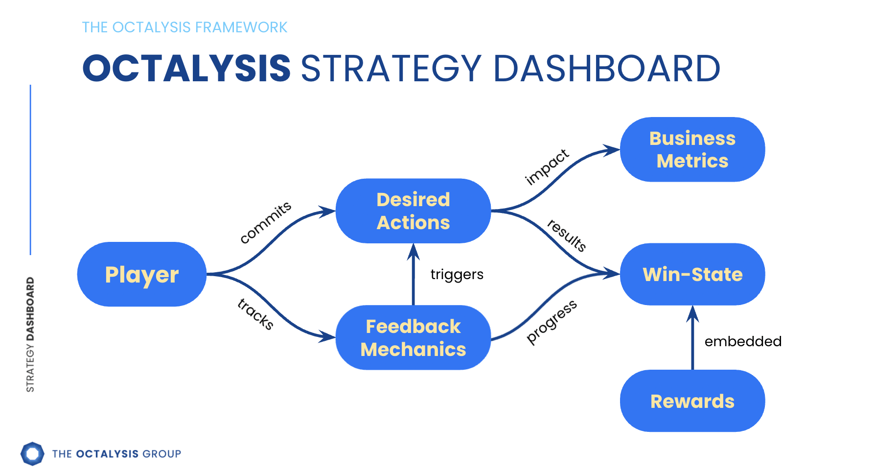
The Strategy Dashboard forces teams to define the essential variables:
- which business metrics matter most
- who the players are
- which desired actions drive the business outcome
- what success looks like for both the user and the organization
- how triggers, feedback, and rewards should support the journey
This step matters because behavioral design is full of tradeoffs. Without clear priorities, teams often optimize the wrong thing.
For example, a learning platform trying to raise course completion should design very differently from one trying to increase weekly return visits. Khan Academy leans into the first framing. Mastery checks, a visible skill tree, and well-timed encouragement near drop-off points keep learners moving toward a finished course. Duolingo leans into the second. The streak counter, the daily quest screen, and the lesson-end “come back tomorrow” prompt all exist to bring you back into the app, not just to push you further along a single track. Same Core Drive families. Different top metric. Different design.
That is why the Strategy Dashboard catches expensive mistakes early. If the top metric is wrong, the rest of the system can be beautifully built and still fail strategically.
Step 2: Octalysis Brainstorming
Once the strategic foundation is clear, the next step is structured ideation.
This usually uses Level II Octalysis, which maps the four Experience Phases against all eight Core Drives. That creates 32 motivational angles to explore.
The purpose is not to generate a balanced checklist for symmetry. It is to generate ideas that are actually relevant to the player psychology defined in the Strategy Dashboard.
A team designing employee onboarding, for instance, may discover that the real problem is not lack of rewards but lack of early confidence. In that case, the brainstorming should produce ideas that reduce uncertainty, create visible progress, and make the first few wins feel safe and attainable, instead of defaulting to generic badges.
The target volume matters. A real Octalysis brainstorm produces 100 to 200 raw ideas across the 32 motivational angles. Anything fewer than 100 means the design space hasn’t been stress-tested. Teams that stop at twenty ideas are picking the first thing that came to mind, then defending it as creativity.
The other discipline is harder than it sounds. Protect bad ideas during the brainstorm. Bad ideas are creative compost. They don’t survive to the final design, but they produce the conditions in which good ideas grow. Someone says “what if we gave everyone a trophy every hour?” Everyone laughs. The laugh triggers another person’s brain to think, “wait, what if it was a surprise that only sometimes happened?” That second idea is real. It would not have emerged without the bad one as a stepping stone.
The most common failure mode is a senior person in the room killing ideas mid-stream. Once that happens, the next three suggestions get safer. By the end of the session the team has self-censored into the same ideas they had before the session started. The brainstorm produced nothing new. Step 2 needs divergence: open, generative, non-judgmental. Step 3 needs convergence: critical, comparative, decisive. Trying to do both at once produces mediocre versions of both.
Step 3: Power/Ease (PE) Feature List
After ideation, teams need discipline. The Power/Ease (PE) Feature List helps prioritize ideas using two variables:
- Power: how strongly the idea motivates the desired behavior
- Ease: how realistic the implementation is
This is where strategy becomes practical. A brilliant idea that never ships is often weaker than a strong idea that gets built and works.
Consider a loyalty program team debating two ideas. Idea one is a tiered social-status quest system, the kind Sephora’s Beauty Insider runs at full scale with VIB and Rouge tiers. Idea two is a simpler post-purchase progress mechanic, the kind Starbucks Stars runs every time you pay. The first idea is more differentiated. The second is far easier to ship. If the first needs months of engineering and heavy cross-team coordination, the second may create earlier learning and faster behavioral gains. The PE lens helps teams stop confusing ambition with priority.
The goal is usually a portfolio, not a single bet. A few harder, high-differentiation ideas can define the experience, while easier high-leverage improvements keep the roadmap functional and shippable.
The novice/expert gap shows up here, not earlier. Most novices score Power on gut feeling: “this idea seems strong.” Experts score Power against three specific dimensions:
- Player-type fit. Does the idea resonate with the actual users defined in the Strategy Dashboard? Different player archetypes respond to different Core Drives. An idea that lights up Achievers can leave Explorers cold.
- Phase alignment. Does the idea fit where in the journey the user is? An Endgame mastery mechanic does nothing for an Onboarding user who hasn’t formed a single habit yet.
- Business-metric impact. Does the idea drive the desired action that links back to the metric in the Strategy Dashboard? Or is it just engaging in some abstract sense?
Scoring against those three dimensions is what catches ideas that feel exciting in the room but would never move the actual needle. Without dimensional scoring, the PE Feature List collapses back into a popularity contest decided by whoever has the strongest personality.
Step 4: Battleplan Spreadsheet
Once priorities are clear, the next challenge is sequencing and coordination.
The Battleplan Spreadsheet maps how features connect to Core Drives, Experience Phases, dependencies, conflicts, owners, timing, and success metrics.
This is where strategy becomes execution.
The Rewards Matrix is the part of this step worth singling out. It helps teams match different reward types to different desired behaviors while accounting for user value, company cost, abundance, and scarcity.
Without this layer, teams often end up with disconnected ideas that sound individually attractive but conflict once they hit a real product roadmap. The Battleplan forces hard calls about sequence, ownership, and tradeoffs before implementation chaos starts.
The discipline rule inside the Battleplan is simple to state and difficult to enforce: every desired action requires a trigger, a feedback mechanic, and a reward attached to it. Motivation is never assumed. If a user is asked to do something and the system has no triggered reward planned for it, the spreadsheet exposes the gap before the engineering team builds it.
The Rewards Matrix sits inside this layer for a reason. Each candidate reward gets four scores: user value (how meaningful it feels to the player), company cost (what it costs to provide), abundance (how easily it can be given to many users), and scarcity (whether its perceived value depends on rarity). A reward that is high-cost, low-abundance, and high user value is a quarterly hero. A reward that is low-cost, high-abundance, and meaningfully valued is a daily workhorse. Most loyalty programs lean too hard on one column. The Battleplan forces a portfolio.
Step 5: Wireframes
The final step is turning the invisible logic into a visible user experience.
Wireframes show where features live, how flows connect across phases, and how the desired action appears on each screen.
The key principle here is simple: the desired action should be the main character. If users cannot tell what matters most at a glance, the interface is probably weakening motivation instead of focusing it.
A healthcare app, for example, might say adherence is the goal, but if the home screen emphasizes educational browsing more than the next required action, the wireframe is quietly undermining the strategy. The contrast between Calm and Headspace makes this concrete. Calm’s home screen leads with today’s session — the desired action sits where the eye lands first. Headspace leads with browsing — content categories, recommended packs, themed challenges. Both are well-designed apps. They are designed for different top metrics, and you can read the strategy off the wireframe before you press anything. Good wireframes do not just organize content. They guide attention toward the exact behavior the system is meant to create.
Wireframes do not need polish first. They need clarity first.
What the User Never Sees
One framing makes the whole pipeline easier to defend, especially to skeptical executives.
Steps 1 through 4 are internal thinking artifacts. The user never sees the Strategy Dashboard. They never see the brainstorm sheet, the PE Feature List, or the Battleplan Spreadsheet. Only Step 5 — the wireframes, and eventually the live experience — reaches them.
That asymmetry is exactly the point. The user does not need to understand why a particular feature exists at a particular phase. They need the experience to feel coherent and the desired action to feel obvious. Coherence and obviousness are downstream of the four invisible steps. Skip those, and the visible product feels arbitrary even when every individual mechanic is well executed.
This is why teams that jump straight to wireframes produce gamification that looks polished and still fails. The polish is on top of nothing. The user picks up on the lack of underlying logic faster than the team expects.
Why This Process Works Across Every Industry
A healthcare app, loyalty program, learning platform, workplace system, or e-commerce journey may look different on the surface. The behavioral structure underneath is often the same. Across every industry, the work reduces to the same five demands:
- Understand the player. Who they are determines which Core Drives motivate them.
- Define the desired actions. What you want them to do anchors every downstream design choice.
- Align feedback and rewards to meaningful behavior. No reward is given without a desired action attached.
- Prioritize intelligently. Power × Ease forces honest tradeoffs between ambition and shippability.
- Make the experience emotionally coherent. The wireframe must guide attention to the action, not away from it.
That is why the same process can work across industries even when the content changes completely.
The Bottom Line
- Clarify the Strategy Dashboard first.
- Brainstorm across the four phases and eight Core Drives.
- Prioritize ideas by motivational power and execution reality.
- Map implementation through a Battleplan.
- Wireframe the journey so the desired action remains visually clear.
This transforms “we want more engagement” into a real design process with diagnostic logic, prioritization discipline, and an implementation path.
Frequently Asked Questions
What is the Octalysis Design Process?
It is a five-step behavioral-design methodology that moves from strategic clarity to ideation, prioritization, implementation planning, and wireframing.
Why do gamification projects often fail?
Because many teams skip the motivational strategy and jump directly into visible mechanics like points, badges, and leaderboards without understanding player psychology or business priorities.
Why is the Strategy Dashboard so important?
Because it defines who the players are, what metrics matter, which behaviors matter, and what the system is actually trying to accomplish before design choices are made.
What does the Battleplan Spreadsheet add?
It turns ideas into an execution roadmap by mapping dependencies, phases, rewards, owners, and success metrics.
Can this process work outside games and apps?
Yes. It works anywhere human motivation matters, including healthcare, education, loyalty systems, workplace design, and e-commerce.
Apply This Process to Your Own Product
If you read this far, you are not looking for a definition. You are looking for a way to put it to work. Three paths, depending on where you are.
Learn it yourself. The full five-step methodology — Strategy Dashboard templates, brainstorming sheets, the PE Feature List, Battleplan walk-throughs, and dozens of wireframe case studies — lives inside Octalysis Prime, Yu-kai’s masterclass. It is the same material we use to train new Octalysis Group consultants.
Hire us to run it on your product. A full Octalysis design engagement runs two to four months and produces a sequenced, prioritized, wireframed gamification plan tied to your business metrics. Tell us about your project and we will tell you whether the five-step process is the right fit before you commit.
Read the books. If you want the underlying framework that powers all five steps, Actionable Gamification is the canonical reference. Browse Yu-kai’s books and pick the one that matches where you are.
Related Reading
- Octalysis: Complete Gamification Framework
- The Strategy Dashboard
- The Battleplan Spreadsheet
- Level II and III Octalysis: The Advanced Framework
- White Hat vs Black Hat Gamification
- HTC VIVE E-Commerce Case Study: 188% Revenue Increase
- The Octalysis Brainstorming Engine
- Books by Yu-kai Chou