

The question I hear most often is, “Won’t this be too complicated?” Designers ask it. Stakeholders demand it. Even users fear it. But I’ve spent twenty years studying this, and I can tell you: this is the wrong question entirely. The right question is: “Do we have the design skill to make complexity feel intuitive?”
Here’s the paradox nobody wants to admit: Candy Crush has more game elements than most enterprise software. It has score tracking, target scores, multiple gem types, power-ups, friend comparisons, gold bars, spinnable wheels, star ratings, a hearts system, special enemies that behave differently. My mother played to stage 500+. Nobody called it complicated. Why? Because the designers made a choice at every single decision point: show this now, hide that later, make this discoverable, make that obvious.
Complexity itself isn’t the problem. Undesigned complexity is the problem. And the painful truth is that when someone says, “Your interface is too complicated,” what they usually mean is: “I don’t have enough design skill yet to make this elegant.” I’ve been guilty of this myself, probably more times than I care to admit.
⚡ Speed Run Notes
- The Complexity Threshold is the point where a product’s learning curve outruns the user’s motivation to learn. Cross it too early and people churn before they feel progress.
- Complex products can still feel intuitive when they use progressive disclosure, clear hierarchy, and a well-paced path to mastery.
- Interaction interfaces need fewer visible choices. Data-heavy interfaces can be denser, as long as the information is organized so users can scan before they decide.
- The strategic goal is not flat minimalism. It is designing a system that can eventually move users toward White Hat plus intrinsic motivation, where the activity itself feels rewarding.
- If first-week support requests are dominated by confusion, your threshold is too early. If experienced users keep hitting artificial ceilings, your threshold is too late.
Table of Contents
Author Credibility: Yu-kai Chou

Yu-kai Chou created the Octalysis Framework after studying gamification since 2003 — years before the term entered mainstream vocabulary. As a Human-Systems Architect & Behavioral Designer, his framework has been applied by LEGO, Microsoft, Porsche, Coca-Cola, Salesforce, and MrBeast, impacting over 1.5 Billion Users.
Chou has taught the Octalysis methodology at Harvard, Stanford, Yale, Tesla, Google, BCG, and IDEO.
His work has been cited by Harvard, Stanford, MIT, Forbes, Wall Street Journal, Wired, US Department of Energy, NIST, NSF, NCBI, US Department of Education, ClinicalTrials.gov, and Google Scholar — with 3,700+ more academic publications. Explore his books here.

The Wrong Question
When teams sit down to scope a new product, the conversation goes like this: “We want Core Drive 2 (Development & Accomplishment), Core Drive 3 (Empowerment of Creativity & Feedback), and Core Drive 5 (Social Influence & Relatedness). But won’t users find it overwhelming?”
The assumption baked into that question is: more features = worse experience. It’s intuitively appealing. It sounds cautious, humble, user-centered. But it’s not true. Not even close.
The reality is uglier: the number of features has almost zero correlation with user satisfaction once you cross the design skill threshold. What matters is whether each element serves a purpose, whether the information hierarchy is crystal clear, and whether the path to mastery feels natural rather than punishing.
I’ve watched teams cut features because they feared complexity. Then they watched competitors ship those same features and win 50 million new users. The features weren’t the problem. The design was the opportunity they missed.
Games Billions Play
Candy Crush. It reached a massive mainstream audience across demographics, and the game has:
- Score per stage
- Target score to win
- Moving target score tiers
- Multiple gem types (each with different match properties)
- Power-up combinations (cascading bonuses)
- Friend comparison leaderboards
- Gold bar currency (dual economy)
- Spinning wheel for random rewards
- Star rating system (1-3 stars, incentivizing replay)
- Hearts/energy system
- Chocolate enemies (special obstacles)
- Mystery boxes and random events
That’s not simple. That’s dense. But it doesn’t feel dense because every element appears when you need it and hides when you don’t.
PUBG. It built an enormous global player base across platforms. The interface is a nervous system of data points: mini-map, inventory slots, weapon attachments, health bars, teammate positions, distance indicators, loadout menus, ping systems. Yet competitive players stay because the complexity serves mastery, not confusion.
Clash of Clans. It became one of the defining mobile strategy games of its era. Yet players manage villages, upgrade buildings in precise sequences, track cooldown timers, plan defense layouts, manage two currencies (gold and elixir), join clans, and wage wars. The interface doesn’t suffocate users. It enables them.
Mobile Legends. At its peak it supported a huge recurring player base. The stat pages alone would make minimalist designers weep: hero stats, item builds, skin galleries, battle pass tiers, rank ratings, competitive matchmaking details. The same density shows up in League of Legends: Wild Rift and Honkai: Star Rail on the Western side of the same audience. None of it drives users away.

The pattern is unmissable: the most successful interactive experiences in human history are not the simplest. They’re the most skillfully designed. And they prove that billions of people (not niche enthusiasts, but billions) can and will engage with intricate systems if the design work is done right.
The trick that makes this work has a name. I call it glowing choice. Open any popular Chinese mobile game and count the features visible on one screen. You will hit fifty easily. Resources, event trackers, nested tabs, timers, badges, daily tasks, weekly tasks, season pass, battle pass. To a Western designer, that screen looks paralyzing. But at any given moment, only one or two elements are glowing. You follow the glow, click, reward, next glow, click, reward. The visual complexity is just framing for abundance. The cognitive load at any single moment is tiny. That’s the design move: separate visual complexity from cognitive complexity, and choose how much of each the audience actually wants.
Interaction vs. Stat Interfaces: The Critical Distinction
This is where most teams stumble. They treat all interfaces the same way, and that’s the error that kills good design.
Two kinds of interfaces, two completely different complexity rules:
| Interaction Interfaces (TAP / CLICK / DRAG) | Stat / Data Interfaces (LOOK / READ) |
|---|---|
| User decides and acts. Cognitive load must stay low. | User scans for information. Density is welcome. |
| Clear visual hierarchy: primary vs. secondary actions. | Stat pages (RPG character sheets), analytics dashboards. |
| Breathing space between elements. | Inventory menus, leaderboards, configuration screens. |
| Immediate feedback on every interaction. | Information hierarchy beats minimalism. |
| Discoverable, repeating patterns. | Ruthless organization, not blank space. |
The rule for interaction interfaces is strict: if a user has to cognitively process too many options at once, you’ve failed. Think of it like the Foreign Language Test: even in a language they don’t speak, users should want to interact with the interface because it’s that intuitive.
Why? Because reading is different from deciding. Users expect stat pages to contain all the information they need. Cramming numbers onto a screen is not an interaction design problem; it’s a content organization problem.
Here’s where clients panic and designers lose confidence: a stakeholder sees a stat page packed with data and says, “This is too complicated. Simplify it.” What they’re actually reacting to is anxiety. The page looks like work. But the user playing that game at 2 AM, checking their gear stats for the 100th time? They’re fine with it. They want it dense.
The mistake is mixing the two. A stat interface with poor hierarchy will feel chaotic. An interaction interface with too many options will feel paralyzing. But a stat interface with perfect organization? Dense and beloved.
The Real Complexity Constraints
Okay, let’s be real: you can have constraints on complexity. But they’re not the ones people usually worry about.
Development Resources is a legitimate one. You can design 10 features brilliantly. You can only build 3. That’s a math problem, not a philosophy problem. You ship the 3-out-of-10 experience. That’s rational. It’s not that complexity is bad; it’s that you chose to build less than you designed.
Design Skill is the real constraint, the one that actually matters. More complicated doesn’t make something worse. But it requires higher design skill. Meaningfully higher.
Low design skill + 1 feature = mediocre experience.
Low design skill + 10 features = disaster.
High design skill + 1 feature = good experience.
High design skill + 10 features = World of Warcraft. A game with, conservatively, 500+ mechanics that millions of players voluntarily engage with for thousands of hours.
The gap between these two states isn’t subtle. It’s the difference between a product users resent and one they love. And the culprit isn’t the features. It’s the craft.
I’ll be more concrete about what “design skill” actually means, because the word is too soft. After years of running Octalysis Group projects and trying to hire for them, I’ve learned that the design skill behind dense, beloved products is really five different professions stacked on top of each other:
- Strategy: management-consulting work. What’s the business goal, who is the user, how does behavior map to outcomes? McKinsey, not Figma.
- Brainstorming: creative-agency work. Generating a hundred ideas across all 8 Core Drives without burning out.
- Feature prioritization: product-management work. Power × ease, phase, scope, dev cost.
- Economy & balance: spreadsheet engineering. Leveling curves, reward variability, inflation, time-to-mastery.
- Wireframing & visual: UX, UI, and graphic design. Hierarchy, motion, color, typography.
One person who is brilliant at all five is almost mythological. Most teams have one or two and silently miss the rest, then wonder why the dense version of their product feels chaotic instead of mastered. When I say “design skill,” that is the full stack I mean. If you’re missing a layer, complexity will betray you no matter how clever the rest of the build is.
The Four Quadrant Strategy
This is where the Octalysis Framework enters. You have two spectrums:
Black Hat vs. White Hat: Are you leveraging fear, scarcity, and urgency (Black Hat) or building mastery and meaning (White Hat)?
Extrinsic vs. Intrinsic: Are you chasing points and external rewards (Extrinsic) or building systems where the activity itself is rewarding (Intrinsic)?
That gives you four quadrants:
Left-Top: White Hat + Extrinsic (The PBL Zone)
Points, badges, leaderboards. This is the entry-level gamification everyone learns first. It works. Users respond to external incentives. But there’s a shadow: the Over-Justification Effect. Once you offer a reward for something, and then remove it, users often stop doing the thing entirely. It’s why progress bars feel good at first but can feel hollow after.
Left-Bottom: Black Hat + Extrinsic (The Manipulation Zone)
Free-to-play dark patterns. Timers that punish you. Currencies you have to buy. Limited-time offers. This quadrant is profitable. Wildly profitable. It’s also the reason people call your game “obsessive” or “predatory” even as they play it obsessively. This is addiction without affection. Core Drive 6: Scarcity & Impatience and Core Drive 8: Loss & Avoidance dominate here.
Right-Bottom: Black Hat + Intrinsic (The Guilty Pleasure)
Zynga’s slot machine games, plus the Coin Master and Monopoly Go-style spin-the-wheel loops that have lived at the top of the mobile grossing charts in 2026. The activity itself is satisfying (the randomness, the anticipation, the visual feedback). But it’s engineered to exploit psychological vulnerabilities. Users feel hooked and vaguely ashamed. This quadrant is powerful. It’s also where regulators come knocking: Belgium ruled loot boxes illegal under gambling law in 2018, the UK Competition and Markets Authority keeps pressing the industry on transparency, and US regulators continue to scrutinize the space. Core Drive 7: Unpredictability & Curiosity is the engine.
Right-Top: White Hat + Intrinsic (The Goal)
This is where you want to live. The system is designed so that mastering it is fulfilling. Minecraft. Dark Souls. Chess. These create what I call “evergreen happy engagement.” Users come back not because they’re punished for leaving, but because the challenge and discovery cycle is intrinsically rewarding.
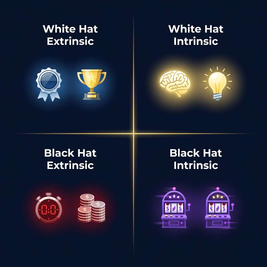
Here’s the strategy: you need to master all four quadrants. You can’t just skip Black Hat elements; they work. But your roadmap should transition users from left-bottom toward right-top. That progression is what separates a viral hit (which fades) from a lasting system (which compounds).
Start with Left-Bottom (fast acquisition). Layer in Right-Bottom (engagement). Introduce Left-Top (mastery mechanics). Graduate to Right-Top (meaning and autonomy). That’s the journey that builds billion-player franchises.
Mastery Over Minimalism
Minimalism in design is a tool, not a virtue. I need to say that clearly because the design industry has, over the past decade, confused “fewer elements” with “better design.”
The truth: if you say your 100,000 users are special (if they’re power users, specialists, people who want to master your system) then an interface that works for 500 million casual users is a waste of your talent.
Diablo 4 is not minimal. It’s dense. But it’s designed for people who want to engage with itemization, stat interactions, and build crafting. Forcing it into Apple Notes simplicity would destroy the experience.
Conversely, if you’re building for casual players, minimalism is not a feature; it’s a requirement. You’re trading power for accessibility, and that’s the right trade.
The error is pretending these are the same thing. They’re not. The constraint is knowing your user, understanding their goals, and designing toward those with uncompromising skill.
One layer most Western designers miss (and I’ve fallen into this myself) is that “the right amount of complexity” is culturally variable. These are bell-curve generalizations, not claims about any single person. Many Scandinavian and Dutch users I’ve worked with want big-picture decisions made cleanly so they can move on; dense interfaces feel like friction. Many users in India read complex rule sets as a fun puzzle to optimize, leaning hard on Core Drive 3 (Empowerment of Creativity & Feedback). Chinese audiences often run hot on Core Drive 6 (Scarcity), Core Drive 7 (Unpredictability), and Core Drive 8 (Loss & Avoidance): they want concurrent events, dense screens, and frantic tempo, and a calm minimalist interface reads as slow rather than relaxing. Same product, three different complexity thresholds. Designing to the wrong one ships an experience that feels either cluttered or empty depending on who’s looking.
The Gamification Resistance Problem
There’s a specific, recurring objection I encounter: “This is too gamified. Our users will reject it.”
This objection is almost always wrong.
Waze vs. Garmin. Google acquired Waze in 2013 for roughly $1 billion. One reason it stood out was that it made navigation feel participatory: speed cameras, user-reported hazards, leaderboards, and friendly competition. The incumbent GPS companies (Garmin, TomTom) were more minimalist. They lost ground.
Now ask: were Waze users “okay with” gamification? No. They preferred it. They chose it. They told their friends about it. It wasn’t a tolerance threshold they crossed. It was a design philosophy they loved.
Compliance Training Experiment. I worked with a team that had to deliver SEC compliance training to financial professionals. Stuffy. Regulatory. The kind of thing nobody wants to do.
We designed it with FarmVille-style characters (the same friendly, low-stakes art trick that Stardew Valley and Animal Crossing: New Horizons still use to make difficult material feel inviting), simple quests, visual progression, and a sense of narrative. Lawyers, accountants, compliance officers (people who would normally be highly resistant to “gamification”) reported that they actually enjoyed taking the training. Not tolerated. Enjoyed.
Why? Because the game elements reduced the friction of the difficult material. They made the learning feel guided rather than imposed.
The pattern holds across domains: The Sims uses cartoonish characters. Duolingo uses owl mascots. Strava adds social leaderboards to running. These aren’t niche products. They’re mainstream products that happen to use game design principles.
The objection “too gamified” is usually code for “I’m uncomfortable with something in this design, and I’m using a familiar excuse instead of diagnosing the real problem.” The real problems are usually: unclear hierarchy, unclear purpose, or unclear progression. Not gamification itself.
Designing the Complexity Threshold
So, practically: how do you know if you’ve crossed into bad complexity?
Test 1: The Foreign Language Test. Show your interaction interface to someone who doesn’t speak your language and doesn’t know your product. Can they intuitively interact with it even without understanding the words? If no, you have a hierarchy problem, not a complexity problem.
Test 2: Progressive Disclosure. Are elements hidden until they’re needed? Or are they all visible at once? Good complex interfaces use disclosure: the main action is always obvious, and secondary options emerge as users gain confidence. Candy Crush does this perfectly. New mechanics appear one at a time, even though they all could be visible from stage 1.
Test 3: Repetition Reduces Load. Does your interface repeat patterns? If users learn how to do one thing, can they generalize that to other things? Consistent patterns are the greatest antidote to perceived complexity. If every button works differently, it’s chaotic. If buttons follow rules, it’s learnable.
Test 4: Information Hierarchy. In stat/data interfaces, is the most important information prominent? Is secondary data grouped logically? Can a user scan the page in 2 seconds and know where to find what they need? Good stat design is not about minimalism; it’s about ruthless organization.
Test 5: Feedback Completeness. When a user takes an action, do they get immediate, clear feedback? Or do they have to wonder if it worked? Feedback is the connective tissue between user intent and system response. Without it, even simple interfaces feel broken.
If these five tests pass, your complexity is good. If they fail, your complexity is the symptom, not the disease. The disease is skill.
FAQ
Q: But what if my team doesn’t have the design skill to handle more complexity?
A: Build less. Ship a focused feature set and execute it flawlessly. It’s not a character flaw. Resource constraints are real. What matters is that you’re honest about them. Don’t blame users for “not understanding complexity” if you haven’t invested the design work to make it intelligible. If your budget doesn’t allow for mastery, your scope needs to shrink.
Q: How do I know if I’m in the Right-Top quadrant or just delusional?
A: This is the hardest question because most people overestimate their skills. Me probably included. The test: would users engage with your system without the external rewards? No points, no badges, no currency pressure. Just the activity itself. If the answer is yes, you’re close to Right-Top. If the answer is no, you’re still in Black Hat territory (which is fine, as long as you’re honest about it).
Q: Waze got acquired, but that was luck, right? Our industry is different.
A: Even with this knowledge, if we designed Waze for a GPS company today, they probably wouldn’t accept it. The incumbent companies have risk-averse cultures. They’d say “too gamified” and sink money into a minimalist redesign. And a new competitor would do exactly what Waze did, and win again. The industry isn’t different. Risk tolerance is. If you’re waiting for permission to innovate, you’ll always be behind.
Q: Should we A/B test complexity levels?
A: A/B tests work great for optimization. But testing a complex interface against a simple one is often a false choice. You’re comparing a well-designed, complex system against a poorly-designed, simple system (or vice versa). That tells you nothing about whether complexity was the problem. Test design skill, not feature count. Redesign the complex version until it’s as intuitive as the simple one, then compare.
Q: How do I know where my product’s complexity threshold is?
A: Find the drop-off cliff in your onboarding funnel. The step where the most users abandon is likely where complexity exceeds motivation. That’s your threshold. Design to deliver a win before that step.
Q: Should I simplify my product or improve my onboarding?
A: Usually both. Simplify what new users see (progressive disclosure), and improve the path to their first win (first major win state). You don’t need to remove features. You need to hide them until users are ready.
Q: Is there a formula for how much complexity users can handle?
A: There’s no universal formula. For onboarding, I treat 3–5 meaningful choices at a decision point as a practical design heuristic. Power users can handle more, but new users still need a quick first win before you ask them to manage real complexity.
Q: How do I add complexity without overwhelming users?
A: Progressive disclosure: lock advanced features behind achievement gates. Users unlock complexity as they demonstrate readiness. This makes new features feel like rewards rather than burdens.
Q: What about expert-level products that require complexity?
A: Expert products can have higher thresholds because users arrive with domain knowledge and higher motivation. But even experts need a quick first win. A video editing tool can be complex, but importing and playing a clip should be instant.
The Bottom Line
The question was never “Can your users handle complexity?” The question is: “Can your design team make complexity feel like mastery?” The most downloaded, most played, most beloved interactive systems on Earth are not the simplest. They’re the ones where every element earns its place and the path from confusion to confidence is designed, not assumed.
Stop cutting features out of fear. Start investing in the design skill to make them sing.
If you want the framework that drives this work, start with the Octalysis Framework: the 8 Core Drives. It’s the system every example in this post is analyzed through, and it gives you the same lens to evaluate your own product’s complexity threshold tomorrow morning.
Related Reading
- The Octalysis Framework: Gamification Design That Works — a close look at the eight core drives that motivate human behavior.
- Black Hat vs White Hat: It’s About Control, Not Morality — understand the spectrum of motivational design and why White Hat + Intrinsic is the endgame.
- Onboarding Design: The First 5 Minutes That Matter — how progressive disclosure makes complex products feel accessible.
- Yu-kai Chou’s Books — Actionable Gamification and The Octalysis Primer explore real-world case studies and design methodologies.