

You just signed up for an app. You did the first thing it asked you to do. A little confirmation flashed on screen, and for half a second you felt that small, satisfying dopamine hit of I’m progressing. Then the screen settled. And the always-visible action button that’s supposed to tell you what to do next is… not on your screen. Maybe it’s below the fold. Maybe it got pushed down by an autoplay video. Or it never existed at all.
You scroll for half a second. You don’t see it. And the single most expensive question in product design fires off inside your head:
What should I do now?
That sentence is the sound of a user about to leave. Probably forever. I’ve sat behind one-way glass watching this exact moment kill activation rates for some of the biggest apps on the App Store, and the design teams shipping those flows had no idea it was happening, because their internal team always knew where to click next.
The fix is so simple it sounds insulting. Your desired action, the next step you want a new user to take, should never be off-screen during onboarding. Not for a moment. I call it the always-visible action rule, and the apps that obey it run circles around the apps that don’t.
⚡ Speed Run Notes
- The most expensive question a new user ever asks is “what should I do now?” The instant they ask it, you’ve lost them. Every onboarding screen should answer it before it can be asked.
- The always-visible action rule: your desired next action must be in the user’s viewport at all times during onboarding. Sticky button, floating action button, persistent header. Pick one and commit.
- Hidden CTAs don’t just hurt conversion, they actively suppress Core Drive 3 (Empowerment). The user feels confused instead of capable, which poisons the whole experience.
- Duolingo, ChatGPT, and Strava all win the same way: there is exactly one obvious thing to tap, it’s never off-screen, and tapping it produces immediate visible progress.
- The smallest possible dose principle pairs with always-visible action: make the first task so trivially easy that failure is impossible (Apple’s “close your rings” is five seconds of standing). Then guarantee the user can find that task in under one second of looking.
Table of Contents
About Yu-kai Chou

Yu-kai Chou is the creator of the Octalysis Framework, the gamification design system now applied to products and experiences reaching over 1.5 billion users. His book Actionable Gamification is one of the most-cited works in the field, and he has been ranked the #1 Gamification Guru in the World.
He has advised MrBeast, LEGO, Microsoft, Porsche, Tesla, Stanford, Harvard, and governments including Ukraine on turning behavioral psychology into product mechanics that change user behavior.
Verify: Wikipedia · Google Scholar · Wikidata · LinkedIn
I’ve audited onboarding flows for products with hundreds of millions of users, and the most consistent finding across all of them is this: the teams shipping the flow can’t see what new users see. They’ve clicked through the screens a thousand times. Their muscle memory knows where every button is. So when a new user opens the app and asks “wait, what do I do now?”, that question is invisible to the people who built the product. This post is the rule I use to make that invisibility impossible.
Note on terminology: In the Octalysis Framework, human motivation is broken down into 8 Core Drives (CDs). We use shorthand like CD2 for Core Drive 2 to refer to these specific motivational levers.
The “What Should I Do Now?” Death Moment
If I had to point to a single second that decides whether a user becomes a fan or a never-again, it’s the second after they finish their first action and don’t immediately know what to do next.
Picture it. New user. Maybe they came from a Twitter thread, a friend’s recommendation, or an ad. They created an account. They did the one thing the app asked them to do, like picking a username, answering a question, or watching a 30-second tutorial. The screen confirms: nice, you did it!
And then the screen just… sits there. Or worse, it scrolls. The next obvious step has been pushed below the fold by a video transcript, a marketing block, a modal that closed too fast, a tour that ended on the home screen with no arrow. The user looks around. Their eyes scan for a colored button. Their cursor hovers. Then the thumb taps the back arrow.
Here’s what’s happening psychologically in that second. The user just got a tiny dopamine hit from completing an action. That hit is fading. Cognitive momentum is at its peak. They want to do the next thing. The friction of doing the next thing is supposed to be near zero. But because the next action is hidden, the friction has spiked. Cognitive momentum minus friction equals motivation, and the motivation just collapsed.
Now the question fires. What should I do now? The user has to think. And in onboarding, thinking is leaking. Every neuron the user spends figuring out where to click is a neuron not spent on the joy of using your product. By the time they figure it out, if they figure it out, the magic is gone. They’ve already started building a story in their head that this app is confusing.
That story is permanent. You don’t get to retell it. You get one shot at first-time activation, and the “what should I do now?” question is the moment that decides which story sticks.

Why a Hidden CTA Kills More Than Conversion
The obvious cost of a hidden call-to-action is conversion drop-off. You can measure that in any analytics tool. But the deeper cost, the one that doesn’t show up in a funnel chart, is what hiding the action does to the user’s emotional state. To see this clearly, run it through the Octalysis Framework.
A well-designed onboarding hits two Core Drives hard:
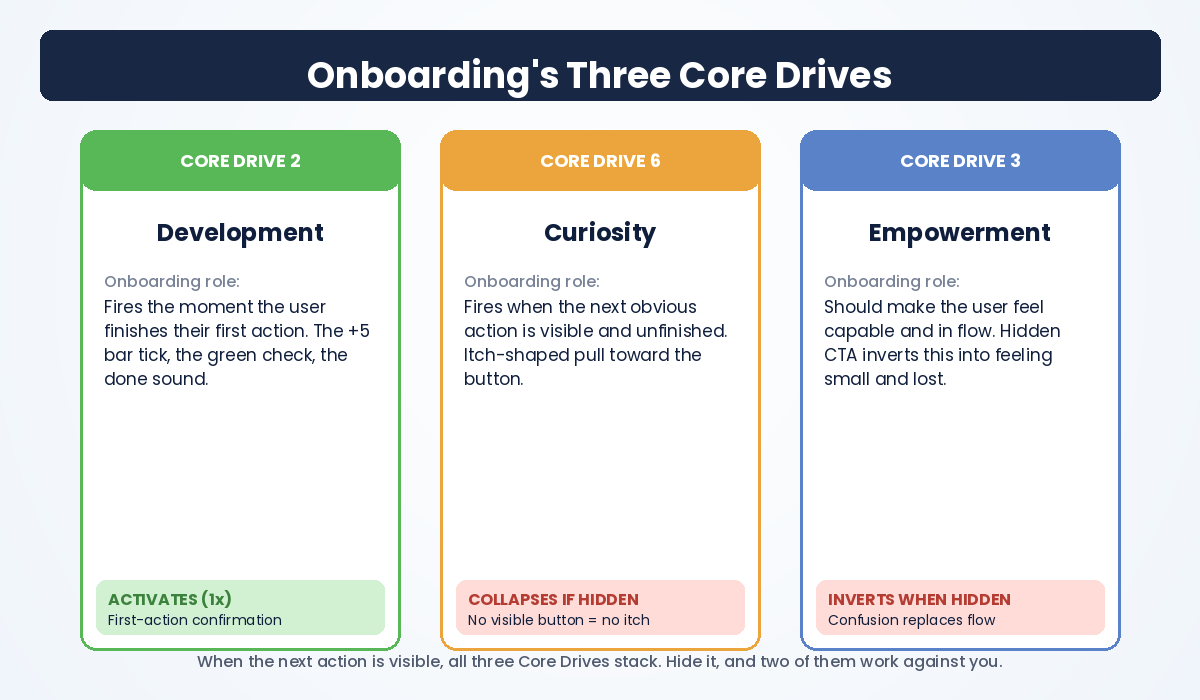
- Core Drive 2 (Development & Accomplishment) activates the moment the user finishes their first action. The little “you did it!” confirmation, the +5 progress bar tick, the green checkmark. These are pure CD2 hits. The user feels capable.
- Core Drive 6 (Scarcity & Curiosity) activates because there’s an obvious, unfinished next step right in front of them. The button is right there. They want to tap it. The unfinished state is itch-shaped.
Now hide the next button below the fold. CD2 still fires once. Fine, the user feels accomplished about what they just did. But CD6 collapses, because the next step isn’t visible, so there’s no shaped curiosity to chase. And worse, you accidentally activate the worst Core Drive in the wrong direction.
Core Drive 3 (Empowerment of Creativity & Feedback) is supposed to make the user feel in control, in flow, like a wizard who can do whatever they want with the tool. When the next step is hidden, the user feels the opposite of empowered. They feel lost. They feel slightly stupid for not finding the button. And the lostness curdles into friction. CD3 doesn’t just fail to activate. It inverts. The interface is making them feel less capable than they did when they walked in.
That’s the hidden tax. You don’t just lose a conversion. You teach the user that this app makes them feel small. And users will permanently associate that feeling with your product, even after they figure out where the button was.
The Always-Visible Action Rule
Here’s the rule. Memorize it.
The desired next action must be in the user’s viewport at all times during onboarding.
Not “usually visible.” Not “visible if you scroll.” Not “visible after the video plays.” At all times. If you can imagine a moment where the user could ask “what should I do now?” and the answer would require them to scroll, hunt, or guess, the rule is broken. Fix it before shipping.
Three implementations work, in order of how aggressive you can be:
1. Sticky bottom bar. The next-action button is anchored to the bottom of the viewport and stays there as the user scrolls. iOS uses this beautifully in the Apple Watch app, where the “Pair Watch” or “Continue” button is always at the bottom, never off-screen. This is the safest pattern for first-time flows.
2. Floating action button (FAB). A circular button that floats above the content, usually bottom-right. Strava uses this with the orange “Record” button. It’s slightly more disruptive but also impossible to miss.
3. Persistent action in the page header. Notion uses this. The “+ New page” or “Templates” action is always at the top of the workspace. It’s the least visually loud option but it requires the user to know to look up.
The wrong implementation is the inline-only button. The button that’s only visible when the user happens to be scrolled to the right place. That’s the pattern that breaks the rule, and it’s the pattern that 80% of underperforming onboarding flows ship with.
How Duolingo Wins the Onboarding Game
Open Duolingo for the first time and watch what they do. They have run more onboarding A/B tests than almost any company alive. With over 100 million monthly active users, they have the data volume to optimize at a level most products will never match. The result of all that experimentation is a flow that obeys the always-visible action rule almost religiously.
Step one: a single, unmissable green button labeled “Get Started.” Not three buttons. Not a header full of choices. One button. The user’s thumb knows what to do before their brain finishes loading the screen.
Step two: a series of single-question screens (“Which language?” “Why are you learning?” “How much time per day?”), each with a giant green “Continue” button at the bottom. The button is anchored. It does not scroll. It does not hide behind a transcript. The user can tap it without looking down.
Step three: the first lesson begins, and the green button transforms into “Check.” Same color, same position, same muscle-memory tap. The user is doing real language learning within ninety seconds of opening the app. Duolingo never makes them ask “what should I do now?” because the green button has already answered that question on every screen.
Now contrast this with the typical SaaS B2B onboarding I audit. The user signs up, lands on a dashboard with seven primary navigation items, six setup tasks, three modals, and a Loom video that autoplays in the corner. Their desired action, let’s say it’s “create your first project,” is buried in a checklist that’s collapsed by default. Our hapless user stares at the screen, can’t find a green button, watches the Loom for thirty seconds out of guilt, closes the tab, and never comes back. Next week, the team meets to discuss why activation is at 11%.
The difference between the two products is not budget, talent, or insight. It’s one rule, applied or not applied.
The Three Patterns That Hide Your CTA
Once you know the always-visible action rule, you start spotting the failure patterns everywhere. Three of them account for almost every violation I’ve seen in audits.
Pattern 1: The Video Push-Down
The product team adds a welcome video to onboarding because executives like welcome videos. The video sits above the next-action button. When the page loads, the button is visible. But the moment the user expands the transcript, dismisses a captions overlay, or the page reflows on a smaller screen, the button gets pushed below the fold. The user never sees it.
This was the original sin Jane McGonigal’s SuperBetter committed in its early onboarding flow, which is the case study that first made me articulate this rule out loud. SuperBetter’s welcome video was good. The transcript was thoughtful. But putting both above the “Get SuperBetter” button meant that the moment a user expanded the transcript to read it, the button vanished. New users hit the “what should I do now?” moment and bounced.
The fix: modal the video. Float the next-action button. Or, best of all, put the button above the video so it’s the first thing the eye lands on, and let the video play below as supporting context for users who want it.
Pattern 2: The Tour That Ends in a Dead Screen
The product ships a guided tour. Each step has a “Next” button. The user clicks Next, Next, Next. Then the tour ends and dumps them on the home screen with no arrow, no highlight, no next-action button. The user has been holding hands the whole time, and now the hand has been dropped and they’re standing in a dim room.
I see this constantly. The tour’s last step is almost always wasted on a “You’re all set!” modal that closes itself. What it should be is a giant, glowing arrow pointing at the single most important next-action button on the home screen, with copy that says “Now, click here to do X.” The user’s muscle memory has been trained for “next.” Don’t betray that training in the last second.
Pattern 3: The Modal That Closes Itself With Nothing Behind It
The user finishes a step. A celebration modal pops up: confetti, “great job!”, three sparkles. Two seconds later, the modal auto-dismisses. Now their screen is the dashboard they’ve never seen before, with no clear next step.
That celebration modal hijacked the user’s attention precisely when their attention was most valuable, then released it into a void. The fix is to never auto-dismiss a celebration modal that doesn’t hand off to a clearly visible next action. If there’s no next action ready, the modal should contain the next action as a button. “Great job! Ready for level 2?” with a giant button. Not just “Great job!” followed by silence.
The Smallest Possible Dose Principle
Always-visible action only works if the action you’re asking for is small enough that the user will actually tap it. This is the companion rule, and it’s where most product teams overreach.
The first action in any onboarding should be so trivially easy that failure is impossible. Apple Watch’s onboarding is the best example I know. The desired behavior is a sustained habit of standing, moving, and exercising every day. The first action you’re asked to take is… close one stand ring, which requires you to literally stand up for one minute. That’s it. You can’t fail. You’re already standing while reading the app. The ring closes. CD2 fires. You’re hooked.
Compare this to a fitness app that opens with “Set up your seven-day workout plan with personalized macro goals.” Even if that screen has a perfectly visible next-action button, the action itself is too big. The user feels the cognitive weight of the question, hesitates, and bounces. The button being visible only matters if the action behind the button is small enough to clear without thinking.
Pairing the two is what makes the magic work:
- Always-visible action guarantees the user always knows where to tap.
- Smallest possible dose guarantees they actually want to tap when they see it.
Either rule alone is half a system. Together, they produce activation curves that look like Duolingo’s. This is the same insight that powers first major win state design: the user has to win once, fast, and the path to that win has to be obvious.
Building the Rule Into Your Product
Here’s the practical checklist I run when auditing an onboarding flow. Apply this to your own product before your next release.
Step 1: Define the desired action for every screen. For each onboarding screen, write down in one sentence what you want the user to do next. If you can’t name the action, the screen has no business existing. Cut it.
Step 2: Open the screen on the smallest viewport you support. iPhone SE, 13-inch laptop, whatever your floor is. Look at the screen without scrolling. Is the next-action button visible? If not, you have a violation. Fix it before reading further.
Step 3: Trigger every state change and re-check. Expand transcripts. Trigger validation errors. Wait for autoplay to start. Check the button visibility in every state, not just the default load. State changes are where most violations hide.
Step 4: Make the desired-action button visually distinctive and consistent. Pick a single color and shape for “the button you should tap next” and use it identically across every onboarding screen. Duolingo’s green “Continue” button is the platonic ideal. The user’s eye should be able to find the button without reading any text.
Step 5: Run the rule against every modal, tour, and confetti animation. The hardest violations to spot are in transient UI elements. Anything that pops up and dismisses needs to either contain the next action or hand off to a visible next action. No exceptions.
Step 6: Watch ten new users live. Not session recordings. Live, over the shoulder, in the same room. The instant a user hesitates and looks around the screen, you’ve found a violation. They’re asking “what should I do now?” in their head. You’re watching the death moment in real time. Fix the violation before the next release.
If you want to take this deeper, the same Octalysis-driven approach applies to retention and re-engagement, not just first-time activation. The full system is in Actionable Gamification. The part on Strategy Dashboards covers how to map every screen of your product to its dominant Core Drives, which is what surfaces the always-visible action violations before they ship.
Frequently Asked Questions
What is the always-visible action rule in onboarding design?
The always-visible action rule states that the desired next action, meaning the button or interaction you want a new user to take next, must be in the user’s viewport at all times during onboarding. If the user can ever ask “what should I do now?” without seeing an obvious answer on screen, the rule is broken. Hidden CTAs cause users to abandon onboarding even when the rest of the design is excellent.
Why does the question “what should I do now?” matter so much in onboarding?
It matters because the moment a user has to think about where to click next is the moment cognitive friction spikes and motivation collapses. New users have a small reservoir of patience. Every neuron they spend hunting for a button is a neuron not spent enjoying your product. The instant they ask “what should I do now?” out loud or internally, you’re seconds away from a permanent abandon. Designing the question out of the experience is one of the highest-impact moves in onboarding optimization.
How is the always-visible action rule different from a sticky CTA?
A sticky CTA is one valid implementation of the rule, but it’s not the rule itself. The rule is about the user’s perception, not the technique. You can satisfy the rule with a sticky bottom bar, a floating action button, a persistent header action, or even a full-screen modal that contains the next action. What matters is that the user never experiences a moment where the desired next action is off-screen.
Which Core Drives in the Octalysis Framework does this rule activate?
The always-visible action rule primarily protects Core Drive 2 (Development & Accomplishment) and Core Drive 6 (Scarcity & Curiosity), and prevents the inversion of Core Drive 3 (Empowerment of Creativity & Feedback). When the next action is visible, the user feels capable, curious, and in control. When it’s hidden, the user feels lost and slightly incompetent, which is the opposite of what onboarding should produce.
What’s a real example of a product that obeys this rule perfectly?
Duolingo’s onboarding is the cleanest example I know. From the first “Get Started” button to the in-lesson “Check” button, there is always exactly one obvious primary action on the screen, anchored at the bottom of the viewport, in the same green color. The user’s thumb knows what to do before their brain finishes processing the screen. Strava, Apple Watch, and ChatGPT obey similar rules with their record button, ring tracker, and message input field, respectively.
Does this rule apply after onboarding ends?
Yes, but the stakes drop. During onboarding, a hidden CTA is fatal because the user has zero context and zero patience. After onboarding, returning users have built mental models of your product and can tolerate more discovery. That said, every state where you’re asking the user to do something specific (upgrade prompts, post-purchase flows, re-engagement nudges) should still apply the rule. The cost of breaking it never goes to zero.
The Bottom Line
If you only fix one thing about your onboarding this quarter, fix this. Open every onboarding screen on a small viewport. Look for the moment the user could ask “what should I do now?” and not have an answer staring back at them. Move the button. Make it sticky. Make it green. Refuse to ship until it’s impossible to miss.
The teams that obey this rule have onboarding flows that feel almost magical to new users. Not because of clever tricks, but because the user never has to think about where to click. They just keep tapping the obvious next thing, and somehow they’re using the product. The teams that ignore the rule wonder why their funnel charts look the way they do, while their best users (the ones who would have loved the product) silently churned in the second after their first action.
Hidden CTAs aren’t a small UX issue. They’re the leak that drains the most expensive moment in your entire user journey. Plug it.
If you want to go deeper into the system behind this rule, start with the Octalysis Framework overview and the chapter on activation in Actionable Gamification. The always-visible action rule is one tactic. The framework that produces it is what lets you spot the next ten tactics yourself.