

A new user just gave you their email. They typed a password. They clicked Sign Up. And in the next ninety seconds, your sign-up flow is about to do three things that, together, will guarantee they never come back.
First, it will punish them for the password they just chose. Then it will hold them hostage and tell them to go check their email. Then, after they’ve found the email, opened it, clicked the link, and waited for the page to load, it will reward all that effort with a single word on a blank screen: Confirmed.
I’ve watched this exact sequence kill activation rates for products that had everything else going for them. Beautiful UI. Clear value prop. Real product-market fit. None of it survives the first ninety seconds, because the team that shipped the flow has never asked what their sign-up actually feels like to a stranger.
The technical name for what those ninety seconds are doing is bad Win State design, and it’s the most common driver of sign-up abandonment in products where the rest of the experience is fine. There are exactly three failure modes, they almost always show up in sequence, and every one of them is a self-inflicted wound that you can fix today.
⚡ Speed Run Notes
- A Win State is the moment a user finishes a Desired Action and the product responds. Bad Win States drain motivation energy, which is finite. Drain enough and the user quits before they ever reach value.
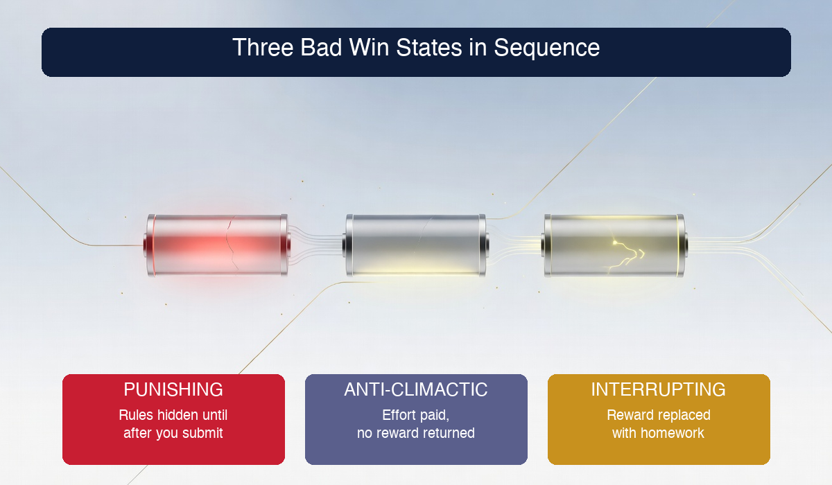
- There are three failure modes: Punishing (user did the right thing, got rejected), Anti-Climactic (user invested effort, got nothing back), and Interrupting Gatekeeper (user reached a milestone, got handed homework instead of a reward).
- Punishing Win States break trust by hiding the rules. Real-time validation fixes them. Show the requirements while the user types, not after they submit.
- Anti-Climactic Win States are a function-focused design failure. The engineer’s goal was “confirm the email.” The behavioral designer’s goal is “make the user feel rewarded for confirming.” The single-word “Confirmed.” page is the worst offender on the modern web.
- Interrupting Gatekeepers are the most expensive of the three because they fire at peak vulnerability. The user just paid the friction tax, they haven’t received the reward yet, and you just sent them away to their inbox where every competing email is an exit ramp.
- If two or more bad Win States fire in sequence with no reward in between, the next Win State has to be spectacular or the user is gone. The emotional debt compounds.
Table of Contents
- What a Win State Actually Is (And Why Most Designers Miss It)
- Motivation Energy: The Resource You’re Quietly Draining
- Bad Win State #1: The Punishing Win State
- Bad Win State #2: The Anti-Climactic Win State
- Bad Win State #3: The Interrupting Gatekeeper
- The Cascading Sign-Up Failure
- A Practical Win State Audit For Your Product
- How This Maps to the Octalysis Core Drives
- Frequently Asked Questions
Author Credibility: Yu-kai Chou

Yu-kai Chou is the creator of the Octalysis Framework, the gamification design system now applied to products and experiences reaching over 1.5 billion users. His book Actionable Gamification is one of the most-cited works in the field, and he has been ranked the #1 Gamification Guru in the World.
He has advised MrBeast, LEGO, Microsoft, Porsche, Tesla, Stanford, Harvard, and governments including Ukraine on turning behavioral psychology into product mechanics that change user behavior.
Verify: Wikipedia · Google Scholar · Wikidata · LinkedIn
I’ve audited sign-up and onboarding flows for products with hundreds of millions of users, and the same pattern keeps appearing in the ones that underperform. The team is proud of the visual design. The team is proud of the copy. The team has never been a stranger filling out their own sign-up form. So they ship a flow where every Win State is a subtle insult to the user, and they wonder why the funnel chart looks like it does. The Win State taxonomy in this post is the diagnostic I use to find those insults before they leak millions of activations.
What a Win State Actually Is (And Why Most Designers Miss It)
A Win State is what happens immediately after a user completes a Desired Action. The user typed the password and hit Submit. They clicked the email confirmation link. Or they finished the onboarding tutorial. The Win State is the response, the moment your product turns around and says something back.
That moment is the most emotionally loaded second in the entire user experience. The user just spent some piece of their attention, time, or trust to do something you asked them to do. They’re sitting there, briefly, waiting to find out whether that was worth it.
And here’s where most product teams trip. They don’t think of the response as a designed object. They think of it as a side effect of the action. The engineer wrote the form-validation logic. The backend confirmed the record. The page reloaded. The Win State is whatever happens to render in that next breath. Nobody designed it. It’s just the consequence of the action.
That’s the bug. The Win State is the most behaviorally important moment in the flow, and almost nobody is designing it on purpose.
This is the same trap I cover in first major win state onboarding design: products race the user toward an arbitrary “completion” while skipping the emotional payoff that earns the user’s continued attention. The taxonomy in this post is the layer underneath that idea. Before you can design the first major Win State, you need to stop accidentally designing bad minor ones.
Motivation Energy: The Resource You’re Quietly Draining
Motivation isn’t infinite. Every time a user takes a Desired Action and the response doesn’t feel worth the effort, a small amount of their willingness to keep going gets withdrawn from a finite reservoir. I call this reservoir motivation energy, and it behaves almost exactly like a battery.
You start every new user session with a roughly full battery. The user is curious. They’ve decided your product is at least worth a try. They have a bit of patience saved up.
Every action they take spends a small amount of that battery. Filling out a form costs energy. Reading instructions costs energy. Waiting for a page to load costs energy. So far, that’s just the cost of doing business.
But here’s the part that makes the difference between a flow that activates and a flow that bleeds. A good Win State refills the battery. The user feels a tiny dopamine hit, a sense of progress, a momentary reward, and the energy they spent on the action is replaced (often with a small bonus on top). A bad Win State drains the battery further. The user spent energy, and the response gave them nothing back, or worse, made them feel slightly stupid for trying.
Two or three bad Win States in a row, and the battery is at zero. The user doesn’t tell themselves a story about Win States. They just close the tab and tell themselves “this app is annoying, I’ll try it later,” which is the polite version of “I’m never coming back.”
This is why the cost of bad Win State design is invisible in the analytics. There’s no event called “motivation energy depleted.” There’s just a drop-off rate that nobody can fully explain, and a strange feeling among the team that the product is fine but the funnel isn’t.
So let’s name the three specific failure modes that drain the battery, because once you can see them, you can’t unsee them.
Bad Win State #1: The Punishing Win State
The Punishing Win State is the simplest of the three to explain and the most painful to experience. The user does the Desired Action correctly, and the system responds by punishing them.
The classic example is the password rejection. The user fills out the sign-up form. Name, email, a password they thought was reasonable. They click Sign Up. The page reloads, scrolls back to the top, and presents a red error: “Your password must contain at least 12 characters, one uppercase letter, one number, and one special symbol.”
None of those rules were shown when the user typed the password. They were enforced after submission, on a screen the user wasn’t expecting to see again. The user did exactly what they were asked to do. They invested effort. They got rejected.
That feeling has a name. It’s the feeling of being incorrectly punished. The rules existed, but they were hidden, and the user was set up to fail. From an Octalysis lens, this triggers Core Drive 8 (Loss & Avoidance) at exactly the moment the system was supposed to be activating Core Drive 2 (Development & Accomplishment). The user came in expecting a checkmark and a welcome. They got told they did it wrong.
The damage isn’t just the lost twenty seconds. It’s the message your product just sent: I will hide the rules from you and then judge you against them. That message poisons every interaction that comes after, even ones you’d otherwise design beautifully.
The Fix: Validate While They Type, Not After They Submit
The fix has been industry-standard since at least 2015 and somehow remains rare. Show the password rules in real time, on the same screen, while the user is typing. A live checklist that turns each requirement green as they meet it. A strength meter that fills up. An inline message that says “needs one number” the second they delete the only number they had.
What this does is convert a Punishing Win State into a series of micro Win States. Every time a green check appears next to a requirement, the user gets a tiny CD2 hit. Instead of one big punitive moment at submission, you’ve created six small wins on the way to submission.
Real-time feedback is intrinsically enjoyable. Punishment after the fact is demoralizing. The exact same rules, presented at different points in the flow, produce opposite emotional outcomes.
The lesson generalizes well past passwords. Anywhere your product validates user input after a submit, ask whether you can validate it during the input instead. Form fields, profile setup, configuration screens, file uploads. Every “you did it wrong” you can convert into a “you’re getting closer” is a battery you didn’t drain.
Bad Win State #2: The Anti-Climactic Win State
The Anti-Climactic Win State is the one I see most often, partly because it’s the easiest to ship by accident. The user invests significant effort, completes a meaningful Desired Action, and the response is… nothing. Or almost nothing.
The platonic example lives in the email confirmation flow. The user signed up. They got told to check their inbox. They left your product, opened their email app, scrolled past five other emails, found yours, opened it, clicked the link, and waited for a new browser tab to load. That’s a real chunk of friction. From their perspective, they’ve just done a small odyssey.
The new tab finishes loading. And the page says, in plain text on a white background: “Confirmed.”
One word. No welcome, no celebration, no next step, no call to action. Often no logo. Sometimes not even a hyperlink back to your product. Just a single past-tense verb that exists because an engineer wrote it as a placeholder and nobody ever came back to design it.
The effort-to-reward ratio is completely broken. The user paid the friction tax of leaving your site, navigating their inbox, finding the email, and clicking the link. The reward should be: “Welcome to the community! You’re officially one of us. Here’s the one cool thing waiting for you on the other side of this button.” Instead the reward was a word.
The deeper issue, and the one that takes a moment to internalize, is that this is a function-focused design failure. Function-focused design asks “what’s the technical task this screen accomplishes?” and the answer is “confirm the email.” Mission accomplished. The page exists. The flag in the database flipped. The engineer ships and moves on.
Human-focused design asks a different question. It asks “what should the user feel when this page loads?” The honest answer is they should feel rewarded for the effort they just made, drawn into the next step, and slightly proud of themselves for being the kind of person who actually completes sign-ups. Function-focused design will never produce that page on its own, because the technical task got completed long before any of those feelings became relevant.
The Fix: Design Every Win State Like It’s the Last One
Treat every Win State like it might be the last interaction the user has with your product, because for some percentage of users, it will be. Then ask whether the response you’re shipping would make a stranger want to come back tomorrow.
For the email confirmation case, the fix is almost embarrassingly simple. The page should say something like: “Welcome aboard, [name]. You’re confirmed. Here’s what’s waiting for you,” followed by a single, obvious button leading to whatever the most exciting first experience inside your product is. A live data visualization. A pre-built starter project. A welcome video from a real person. Anything that converts the moment from blank to bright.
The deeper rule: the size of the Win State response should scale with the size of the friction the user just paid. If they did a small thing, a small celebration is fine. If they did a multi-step thing that involved leaving your product and coming back, the response needs to be large enough to repay that investment. Sneaking a one-word response after a multi-step action is the design equivalent of borrowing money and paying back in pennies.
Bad Win State #3: The Interrupting Gatekeeper
The Interrupting Gatekeeper is the most expensive of the three, and the one most teams don’t even recognize as a Win State at all. The user reaches what should be a Win State, and instead of a celebration, the system immediately demands more work.
The textbook case is the post-sign-up email gate. The user fills out the form. They pick a username and a password and confirm both. They click Sign Up. The screen loads, and the message is: “We’ve sent you a verification email. Please go to your inbox, find the email from us, click the link inside, and then come back to continue.”
Read that message again from the user’s perspective. They just paid a high friction cost (filling out a form, creating credentials, hitting submit). They have not yet experienced any value from your product. And the first thing your product says to them, at peak vulnerability, is: leave us, do unrelated work, and please come back.
This is catastrophic for three reasons that compound on each other.
The first is that you’ve replaced a reward with a chore. The user expected to see your product. They got an instruction to go elsewhere. CD2 didn’t fire. CD6 (Scarcity & Impatience) collapsed because the next visible interaction is an email task, not a product experience.
The second is that you’ve handed them an exit ramp. Their email inbox is the most distraction-rich environment on the modern internet. Other emails are waiting. Slack pings, calendar reminders, a Substack they’ve been meaning to read. The probability that a user successfully navigates from your “check your email” page back to your product, on the same session, with intact motivation, is dramatically lower than most teams assume.
The third is that you’ve signaled that your product doesn’t trust the user yet. You’re at the beginning of a relationship and the first thing you said was “prove it.” That’s a tone-setter the user remembers, even if they can’t articulate why their first impression is slightly off.
The Fix: Reverse the Order of Trust and Verification
The fix is to let the user experience the product first, then verify the email later. Most modern apps now do this. The sign-up button drops the user directly into a working product session. They get to see the dashboard, click around, maybe complete a quick win. The email verification happens asynchronously, with a soft prompt at the top of the screen that says “verify your email to enable [feature].” The user is already invested by the time they’re asked to verify.
If you absolutely must verify before letting them in (regulated industry, payment-gating, etc.), then at minimum design the “check your email” page itself as a Win State. Make it celebratory. Pre-load the email-app deep links so they don’t have to hunt. Use a magic-link login pattern that re-opens the app automatically when they click the email. Anything that closes the gap between “you have to leave us” and “you’re back inside the experience.”
The general principle: any moment your product has to interrupt the user, audit whether that interruption is actually necessary. About 70% of the time, the answer is no. The interruption was a habit inherited from an earlier era of the web, not a real product requirement. Cutting those interruptions is one of the highest-leverage moves available to most teams.
The Cascading Sign-Up Failure
Here’s the part that makes this taxonomy practical. Bad Win States don’t usually appear in isolation. They cascade. The same flow that has one bad Win State almost always has all three, in sequence, because they’re each symptoms of the same underlying mistake: nobody designed the response, they just designed the action.
Walk through a generic sign-up flow with the taxonomy in hand and you’ll see exactly where sign-up abandonment comes from.
Step 1. The user fills out the sign-up form, picks a password, hits Submit. The password gets rejected because it didn’t meet the hidden requirements. Punishing Win State. Battery drains.
Step 2. The user retries with a stronger password and gets through. The next screen tells them to go check their email before they can do anything else. Interrupting Gatekeeper. Battery drains again, and now the user is in their inbox surrounded by competing emails.
Step 3. The user finds the confirmation email, clicks the link, waits for the page to load. The page says “Confirmed.” That’s it. Anti-Climactic Win State. Battery drains a third time.
Three Desired Actions. Three bad Win States. Zero rewards. And this entire sequence happens in the Discovery phase of the experience, before the user has even reached Onboarding. By the time the actual product loads for the first time, the user has been emotionally taxed three times in a row without a single payoff.
The painful truth is that products with this exact flow are everywhere. They’re the default. The cascade is so common that most teams reading this post will recognize their own flow described step by step.
The good news is that the cascade also makes the fixes load-bearing in a useful way. You don’t have to rebuild the whole product. Convert one bad Win State into a good one and the next one immediately benefits, because the user arrives at it with more battery left over. Fix two and the entire flow starts to feel like it cares about the user. Fix all three and you’ll watch your activation rate move in a way that makes the data team ask what changed.
A Practical Win State Audit For Your Product
Here’s the diagnostic I run on a flow when I want to find the bad Win States fast. It takes about an hour for a typical sign-up, and you can do it yourself today.
Step 1: List every Desired Action in the flow. Open your sign-up and onboarding from a fresh browser, in incognito, with no auto-fill, on a phone if your product is mobile-first. Every time you tap a button, fill a field, or click a link, that’s a Desired Action. Write them down in order. You’ll probably end up with somewhere between five and fifteen for a typical flow.
Step 2: For each Desired Action, name the Win State. What does the product show or say immediately after that action completes? Be specific. “The screen reloads” is not a Win State, that’s a state change. “The screen reloads to a green checkmark with the text ‘Account created. Welcome aboard, Jamie’ and a button that says ‘Take a quick tour’” is a Win State.
Step 3: Classify each Win State into one of four categories.
- ✅ Rewarding — the user feels acknowledged, excited, or delighted. Their battery refills.
- ⚠️ Anti-Climactic — the user feels “meh” or wonders “is that it?” Their battery drained without payback.
- 🔴 Punishing — the user feels rejected, confused, or penalized. Their battery drained AND they got an unpleasant emotion.
- 🚧 Interrupting — the user is sent away, given homework, or handed unexpected work. Their battery drained AND they’re now distracted.
Step 4: Look for sequences. If you see two or more ⚠️ / 🔴 / 🚧 in a row without a ✅ between them, you’ve found a motivation energy leak. That’s the section of the flow that’s silently killing your activation rate.
Step 5: Fix the sequence, not the individual screens. The temptation is to optimize each bad Win State in isolation. The higher-leverage move is to design the sequence as a single arc with a clear emotional payoff at the end of it. Three small ✅s in a row beat one giant ✅ at the end of three ⚠️s, every time.
Step 6: Re-run the audit on the next user state. The Win State you ship for first-time activation is not the same as the one you ship for returning users, or for users who failed once and came back. Each state is its own audit. The patterns repeat across them, but the specific fixes don’t.
If you want to put this audit into a fuller behavioral framework, the natural next step is to read about the onboarding belonging equation, which covers the second layer of the same problem: even after you’ve fixed the Win States, you still need to give the user a reason to feel like they belong inside your product.
How This Maps to the Octalysis Core Drives
Bad Win States aren’t just a UX issue. They’re a behavioral one, and the Octalysis Framework gives us a precise vocabulary for what each failure mode is doing under the hood.
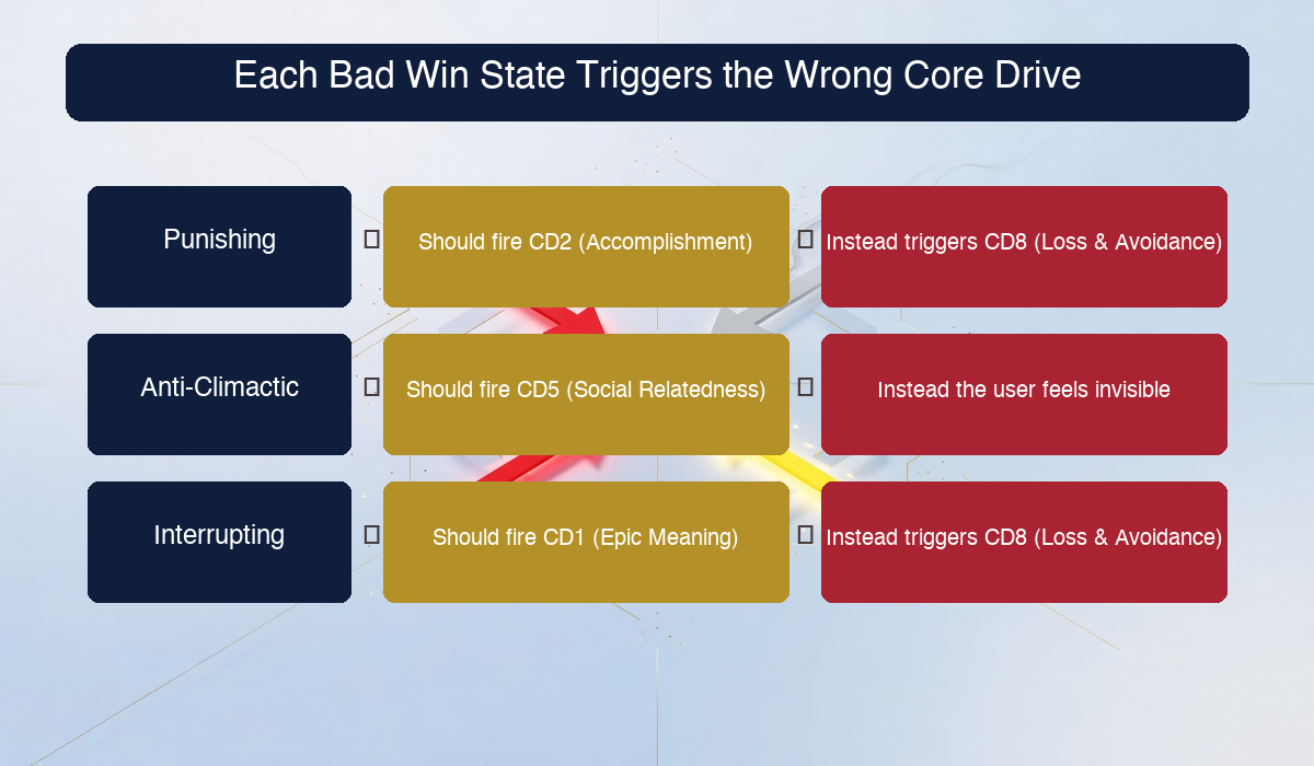
A Punishing Win State accidentally triggers Core Drive 8 (Loss & Avoidance) at the exact moment the user expected Core Drive 2 (Development & Accomplishment) to fire. The user prepared for a small win and got a small loss instead. The cost isn’t just the rejection itself, it’s the bait-and-switch quality of the moment, which is one of the most trust-eroding things a product can do.
An Anti-Climactic Win State fails to fire Core Drive 5 (Social Influence & Relatedness) when the user crossed a threshold that emotionally deserves social acknowledgment. “Confirmed” on a blank page is the absence of any social signal. A real welcome (“You’re officially one of us, here’s where to start”) is what CD5 looks like when it’s designed on purpose. CD2 also gets shorted because the user did real work and didn’t get the accomplishment payoff.
An Interrupting Gatekeeper triggers Core Drive 8 (Loss & Avoidance) in a different way. The user has invested effort but hasn’t received value, and the system just told them they have to do more before getting any payoff. That’s a perceived loss against a not-yet-realized gain, which is the worst psychological position to put a user in. It also fails to engage Core Drive 1 (Epic Meaning & Calling), which is the drive that would have given the user a reason to push through the friction. Without CD1, there’s no narrative reason to climb the gate, just a bureaucratic instruction to.
The unified pattern: bad Win States activate the negative drives (loss, avoidance, friction) at moments where the design intent was to activate the positive drives (accomplishment, belonging, meaning). The taxonomy in this post is a way of catching that mismatch before it ships.
Once you internalize the four-category audit, you start seeing it everywhere outside of sign-ups. Checkout flows. Re-engagement emails. Feature unlocks. Failed payment retries. Anywhere a user takes a meaningful action and waits for the response, the Win State taxonomy applies. The deep version of all of this lives in the chapter on Strategy Dashboards in Actionable Gamification, where I cover how to map every screen of a product to the Core Drives it should be activating, which is what makes bad Win States visible in the first place.
Frequently Asked Questions
What are the three types of bad Win States in product design?
The three bad Win States are the Punishing Win State (the user does the right thing but gets rejected, often because the rules were hidden until after submission), the Anti-Climactic Win State (the user invests significant effort but the response is minimal, like a blank page that says “Confirmed”), and the Interrupting Gatekeeper (the user reaches a milestone but instead of a reward gets handed more work, like being told to go check their email). Each of them drains the user’s motivation energy, and they almost always appear in sequence inside underperforming sign-up flows.
What is motivation energy and why does it matter for sign-up design?
Motivation energy is the finite reservoir of patience and willingness a new user brings to your product. Every Desired Action you ask them to take spends a small amount of that energy. A good Win State refills the reservoir. A bad one drains it further. If two or three bad Win States fire in sequence, the reservoir hits zero and the user quits, often before reaching anything that would have shown them the value of the product. Designing Win States is the load-bearing way to keep the reservoir from emptying during the highest-friction phase of the user journey.
How do I fix a Punishing Win State on a sign-up form?
Move the validation from after-submit to during-input. Show password rules in real time as the user types, with each requirement turning green as it’s met. Use inline error messages on form fields the moment they go invalid, not at the end of the submission. The same rules that produce rejection on submit produce a sense of progress when shown live. Real-time feedback is intrinsically enjoyable. Punishment after the fact is demoralizing.
Why is “Confirmed.” on an email confirmation page such a problem?
Because the user invested real effort to get to that page. They left your site, navigated their inbox, found your email, clicked the link, and waited for a new tab to load. The reward should match the friction they paid. A single word on a blank page is the design equivalent of borrowing a hundred dollars and paying back in pennies. The fix is to design the confirmation page as a celebration: welcome the user by name, tell them what’s waiting for them inside the product, and give them one obvious button that takes them to the most exciting first experience you have.
How does this relate to the Octalysis Framework’s Core Drives?
Each bad Win State accidentally activates the wrong Core Drive. Punishing Win States trigger Core Drive 8 (Loss & Avoidance) when the user expected Core Drive 2 (Development & Accomplishment). Anti-Climactic Win States fail to fire Core Drive 5 (Social Influence & Relatedness) at moments that deserved social acknowledgment. Interrupting Gatekeepers trigger Core Drive 8 again, and fail to engage Core Drive 1 (Epic Meaning & Calling) which would have given the user a narrative reason to push through the friction. The taxonomy is a quick way to catch these activation mismatches before they ship.
Should I just remove email verification from my sign-up flow entirely?
Not necessarily, but you should reverse the order. Most modern products let the user into a working product session immediately and verify the email asynchronously, with a soft prompt at the top of the screen. The user gets to experience value first, then verifies their email when they have a reason to. If you absolutely must verify before granting access (regulated industry, payment requirements, fraud prevention), at minimum design the “check your email” page itself as a celebratory Win State and use magic-link patterns to close the gap between leaving the product and returning to it.
The Bottom Line
The teams that ship the best sign-up flows aren’t the teams with the biggest budgets or the prettiest designers. They’re the teams that have internalized one idea: every Desired Action you ask the user to take has a Win State on the other side of it, and that Win State is a designed object whether you treat it as one or not.
If you skip the design step, your defaults are punishing, anti-climactic, or interrupting. Sometimes all three in sequence. The user pays the friction tax of doing the action and gets nothing back, or worse, gets penalized for trying. Their motivation energy drains. They quit. You blame the funnel and start a new initiative to redesign the landing page, which won’t help, because the leak isn’t there.
Run the audit. Find the cascade. Fix the Win States in sequence as a single arc, not as isolated screens. Watch what happens to the activation rate.
Where to Go Next
If this taxonomy is useful, here is the order I would read in:
- The Octalysis Framework for the master vocabulary the Win State taxonomy is a subset of.
- First Major Win State Onboarding Design for the layer above this one, on what a great Win State actually looks like.
- The Onboarding Belonging Equation for the next behavioral layer, on why users decide they belong inside a product.
- The Desired Action Audit for the prerequisite discipline that makes Win State audits possible.
- Actionable Gamification for the applied playbook, including the activation chapter referenced above.
If you want the full system behind this taxonomy, start with the Octalysis Framework and read the chapter on activation in Actionable Gamification. The three bad Win States are one slice of a much bigger picture. The framework is what lets you spot the next ten failure modes yourself.